Wednesday, November 30, 2011

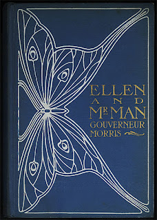
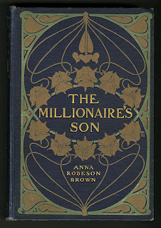
Art Nouveau Book covers, by 'Decorative Designers'


I've been a book sniffer for a long time. There, I said it. I like to wear a trench-coat and sneak into the back of the used bookstore and stick my nose in dusty old books. New, old, it doesn't matter. I still remember the smell of my brand new school books from when I was a kid. Before we get started, the answer is no, they don't make them like they used to. There are many reasons for that, but here's the short version:

Until the 19th century, books were sold unbound or sewn into simple paper covers. A collector of books would commission the local bookbinder to come up with a binding for all the books of his library. By about the 1860s, soon after the American Civil War, cloth bindings became popular and began to feature gilt stamps, blind embossing and flamboyant custom designs. As binding technology advanced, so entered the Arts and Crafts, Art Nouveau and Art Deco movements creating an artistic confluence that produced extraordinarily beautiful book covers in a short space of time. Then came paper dust-jackets which, alongside a change in public taste, caused the decline of these decorative cloth bindings. That was the end of that.


"Most significant in the last decade of the [Nineteenth] century, particularly in America, is the rise of the artist-designer. From the late 1880s until about the start of World War I, book covers reached new levels of sophistication through highly professional layouts and stylized pictorial representations.

"Architects, landscape painters, illustrators and graphic artists alike were drawn to book design. While some of these designers would be responsible for only a handful of covers, others were extremely prolific, producing hundreds and hundreds of covers. Consequently, decorated cases of this period display an astonishing diversity of design styles and reflect a wide range of influences, including the Arts and Crafts movement, Art Nouveau, Japanese prints and the so-called poster style of design." (source)


In stepped the Decorative Designers (or DD as the company was called), in 1895. It was founded by the husband and wife team of Henry and Lee Thayer, a talented and incredibly driven team of artist-designers with a real head for business. "The founder of the firm was Henry Thayer (1867–1940) who was trained as an architect (following the example of Stanford White, architect-book cover designer). Thayer was responsible for much of the lettering produced by the firm." Henry was the business guy, and did a lot of the lettering, but Emma Redington Lee (1874–1973) as she was actually named, was the real star in my opinion.

She started out as a mural artist, but upon co-founding DD with Henry, became a serious figure in publishing and design. Lee Thayer (as she was known) specialized in decoration, and designed most of the bindings including the beautiful decorative borders and designs, and also published over sixty mystery novels as well as many Children's books. She was responsible for designing a staggering amount of titles in a relatively short space of time. Anything up to 20,000 by some estimates. "During the heyday of decorated publishers' bindings no other American designer produced as many book covers as The Decorative Designers." (source)

The Decorative Designers monogram appeared on over 25,000 book covers, dust jackets, and text decorations. Still thirsty for more examples? I posted over one hundred here.


Henry Thayer and Emma Redington Lee Thayer were married in 1909 but later divorced in 1932, on the grounds of desertion. Who deserted whom, I don't know. I can guess, but I'd like to think Lee jumped into a 1920 Revere Tourer and sped off with her tennis instructor Rupert, silk scarf flying.


"Other graphic designers as talented and prolific as the Thayers worked for the company at various times, the most important being Jay Chambers, who was with The Decorative Designers from 1902 through 1916. The firm produced thousands of book covers at a rapid rate. The number of artists in the organization partly accounted for this. Another factor in the success of the “DD's” was its efficient and innovative method of operation. Labor was divided according to individual talents: Henry Thayer did lettering and handled business affairs, Lee Thayer specialized in conventionalized decorations, Jay Chambers excelled at figure design, and so on." (source)


Their designs were often initially sketched by hand, then transferred to brass plates and engraved by Rome K. Richardson and Adam Empie, both of whom occasionally designed covers individually using the monograms RR and a conjoined AE, respectively. Charles Buckles Falls (d.1960) and Jay Chambers (d. 1929) were in charge of drawing the figures featured in narrative designs. (source)

"After 1900, cover designs gradually became simpler. By 1910, the widespread use of decorated cloth on books was largely at an end. The illustrated paper book jacket, which had been in limited use for years, caught the public's fancy and proved to be an even cheaper advertising tool than decorated cloth cases. The golden age of publishers' bookbindings was over." (source)

It was a short but illustrious run. 


One of my faves, with no less than Maxfield Parrish illustrating

The distinctive double D logo that appeared on their designs


Decorative Urns in Drawings and Paintings

Simple curves emphasize the play of light on this English vase. Jeffrey Wyatville, Derbyshire (1820)

"Monsieur, je deteste les urnes! Elles devraient être brisées en morceaux pour pavez nos rues!"

Not exactly sure why I wrote that in French, as Johnson was a blue-blood Brit. Probably because I knew it would piss him off. Anyway, Johnson may want them smashed to pave our streets, but I happen to like urns. Especially old drawings and paintings of them.

They come in pretty handy for designing murals, too. Throw in an ornamental urn or two and you've instantly grounded your landscape and added an extra dimension of historic authenticity. That's why I tossed one into the mural above. I feel that their symmetrical curves and tight decoration offset a loosely painted landscape nicely. Reference images can be hard to come by, so I'm posting some here for you.

Mural I did for Kips Bay Show House, New York City

The urn I used in the mural, by Claude Ballin for Versailles (1665)

A little moss will help your urn 'sit' in your landscape. Charles Nizet, Chateau de Raray

Up to the challenge? Try painting this Charles le Brun vase. Versailles, (1678)

I love the shape of this tree. Urn by Claude Ballin for Versailles (1665)

All Illustrations above are from a fantastic book that I highly recommend, called Garden Vases, with incredible paintings by the talented architectural painter, Andrew Zega.

Architectural drawings of urns are scattered throughout literature. Architects on their Grand Tours of Italy and France would painstakingly measure and draw every urn they came across, along with everything else. I've collected a few together for you here. Whether you use them as reference material is up to you, I enjoy them simply as an example of draughtsmanship and the thirst for knowledge displayed by their authors.

from; William Pain, House Carpenter (1792)
from; Ornamental Drawings, Batty
Urns and Ornaments, by Benjamin Asher
Urn engraving, by Stefano Della Bella
'The Breakers' Mansion, Rhode Island
By George Smith, Cabinetmaker


I posted a huge set of Blouet's drawings here.

And the last word goes to the great Paolo Uccello

Monday, November 28, 2011

Bruchsal palace, a Baroque Masterpiece

The staggering cupola of Schloss Bruchsal, a masterpiece of baroque decoration

"I have now selected the place for my residence. I have never seen a more beautiful location in all my life." So said Damian Hugo von Schönborn in 1720. He wasted no time drawing up plans for no less than fifty separate buildings to occupy the grounds that comprise the palace. He said the reason he wanted so many buildings was so that, in the event of war, he could run into another building if one got damaged.

Detail of the grotto ceiling (photo)

There were, of course, the usual construction hiccups that happen on any project. Only these were a whole lot bigger. Balthasar Neumann stepped in when the going was rough, and created the gorgeous twin staircase that is one of the reasons his face ended up on the 50 Deutsche mark banknote. "The staircase in Bruchsal was the queen of all staircases in the baroque style, unparalleled in it's brilliant design and the high poetry of the room." (Georg Dehio)

Another of Marcini's ceilings, this one for Weissenstein Palace

Two painters, Johannes Zick and Giovanni Francesco Marcini were responsible for much of the work. Zick spent nine years working in Bruchsal, Marcini spent five, completing the dizzying illusionistic painting.

The Main Hall at Schloss Bruchsal

Detail of the rotunda ceiling in the Main Hall (photo)


Ceiling detail from the Marble Room (photo)

Hugo's vision seems prescient in hindsight: Bruchsal, like many towns in Germany, was absolutely devastated during the Second World War. The palace was barely standing, and debate raged as to whether it was even worth trying to restore it.

The palace was devastated in an air raid lasting only forty minutes on March 1st, 1945

I guess they fixed it (photo)

Wednesday, November 23, 2011

The Origin of Painted Ornament

Ornament drawing by Guillaume Abel Blouet

Was Greek sculpture painted? If so, what did it look like? It's a question that has had scholars debating for a very long time. Guillaume Abel Blouet was first to start the fire-storm (in the 1820s) by suggesting that Greek statuary had once been brightly colored. In his L’Expédition Scientifique de Morée he published reconstructions of major Greek and Byzantine monuments, demonstrating his theory by painting them in colorful hues.

"This touched off a controversy as to whether classical works were poly-chromed, an assumption counter to Winckelmann and other earlier classical historians." source

Blouet published several volumes of gorgeous drawings from his trips to Rome, including these few examples of painted ornament from 1823. I posted over 140 of his drawings from the Roman volume here, on my Flickr page. They are fantastic reference material for murals too, by the way.


From "Ensemble de Dessins de Rome et Ses Environs" by Blouet, 1823
Winckelmann was considered the father of art history, and anything he said on the subject was considered gospel. Here comes Blouet and over-turns our whole notion of what we consider 'Classical'. [The controversy must have been short-lived, however, as Blouet was appointed architect for the completion of the Arc de Triomphe, in Paris in 1836].

What's interesting to me is that his theories, though grudgingly accepted, were quickly swept under the rug. Nobody ran out with brushes to slap a coat of paint on all the monuments of Paris. We have been conditioned to prefer the bleached and faded statues as they stand in our Museums. "Centuries of burial or neglect had bleached the marbles, and greened the bronzes, beyond their makers' recognition. But it was those altered colors that became the model for how the ancient world had looked, and for what all new sculpture ought to look like." source

Or, as Gurewitsch writes: "Though we seldom think about it, such fragments are overwhelmingly abstract, thus, quintessentially "modern." And for most of us, that's not a problem. We're modern too. We like our antiquities that way."

Athena, colored according to research by Brinkmann
We now know that Blouet was correct: the Greeks did in fact paint their statuary with high chroma colors of great variety. 

The Smithsonian describes the above pictured re-construction of the statue of Athena, showing the color palette of the ancient Greeks as determined by archaeologist Vinzenz Brinkmann. Brinkmann has been painstakingly researching for the last 25 years

"The partial color reconstruction of Athena is based on a c.490 B.C. sculpture of the Goddess from the pediment of the Temple of Aphaia on the Greek island of Aegina. Vinzenz Brinkmann typically leaves areas white where no evidence of original coloration is found. This rear view of the statue emphasizes the elaborate detailing of Athena’s aegis, or cape, trimmed with the life-like bodies of partially uncoiled green snakes."

Brinkmann himself has struggled somewhat with the gaudy palette. "If people say, ‘What kitsch,’ it annoys me but I’m not surprised,” he says. 

What pigments did they use exactly? Hard to say. "Even after extensive visual and scientific analysis of the original sculptures, scholars still don't know if the paint was applied in one or two coats, how finely the pigments were ground, or exactly which binding medium would have been used in each case--all elements that would affect the appearance of a finished piece. Generally, though, the color reconstructions in the exhibition "truly look closer to ancient sculpture than just the plain white marble"." archaeology.org

The Alexander Sarcophagus as it originally appeared