Showing posts with label Architectural Ornament. Show all posts

Wednesday, November 9, 2016

How to Paint the Figure in Trompe l'Oeil

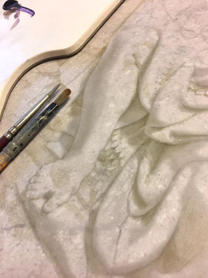
Here is a detail from the finished painting, enlarged because I used very small brushes.

You can use any background you like. I used an old faux-painted limestone sample I had lying around, but you could just as easily do this on faux bois to imitate the look of carved wood. The only stipulation I'd make is that to get the best effect, your background should be no darker than mid-range on the value scale.

In the next image, you can see the brushes I used. One small pointy one, and another splayed out and busted one. When doing shadows, I'd paint with Mr. Pointy then stipple and soften with the busted one. I'm not very fussy about materials or brushes. When I was young, I used to read all those manuals and study hard to learn the "secret" materials that would give me the edge. The only secret, I learned, is your eyes.


Step 1
 If you look closely in Step 1, you can just make out the pencil lines I used to establish the basic design. I took a photo of a bas relief panel at the Met as my reference. This is actually the first time I've used a photograph of actual relief as reference material. Mostly, I'm either inventing relief or copying another trompe l'oeil painter's work (who probably also invented the relief). This was a great chance for me to exercise Rule # 1 in illusionistic painting: Paint what you see, not what you know. 

It's all too easy to fall back on what we "know" about Form rather than simply using the evidence presented before our eyes. "Shadows are dark; highlights are white; reflected light goes here; etc." These are all learned rather than observed truths. [Painters use old tricks such as flipping their image upside down, or examining their work in a mirror, to escape the natural tendency to paint what we think we see.]

Step 2
Step 2 shows the completed shadows. There are no highlights at all here. You can see that the effect is 99% complete already. We could easily leave it like this, and call it a day.

I build the shadows very slowly using Ultramarine and Raw Umber acrylic paint, mixed with a little matte varnish (which dries quickly so I can keep working) as a medium.

The shadows are built up in layers. I never try to establish the darkest dark in the first pass. It's much more tentative then that. I build up darks in translucent glazes, always erring on the lighter side. I tend to work back and forth all over the image, as opposed to finishing each area completely as I go.

Step 3
Step 3 is my first pass at highlights. They might be hard to detect on your screen, as they are very subtle, but they are there. I used an opaque white, mixed with yellow and a little purple. I've heard that some people like to shift the hue of their highlights in opposition to the background color in order to make them pop more. [In other words, if the background hue is yellow (as with mine), they might shift their highlights into purple so that they jump out at you.] I don't do this. I use a lighter value of the background.

Use highlights very sparingly! As subtle as mine might look to you, when I look at the opening detail image of this post, the highlights jump out at me as being too strong and brushy. The image looks like it's been dusted with snow.  The shadows are soft and muted, as they should be, but the highlights are harsh, overused and overly delineated. We want to avoid this at all costs. (It was too late for me).

Step 4
 In Step 4, the only difference is that I carefully glazed the chest, top of the head, and the right knee with a second highlight. I decided that those three areas should be a little more prominent than they were.

It will be easier to see the differences between stages if you view these images in slideshow mode, and scroll between them.

Step 5
 Step 5 might be hard to see, but I think it made a difference. Since all my highlights were already laid down, the only way I could make the relief pop a little more was by darkening the background. I explained the reasoning behind this in a separate post about relative value, here.

I certainly didn't want to add any more highlights, as mine were already too bright. Instead, I used a very washy ultramarine/raw umber glaze and stippled it all around the top right corner, outside the main figure.

I also used a glazed version of my highlight color and subtly lightened the bottom left corner (again, outside the figure only).

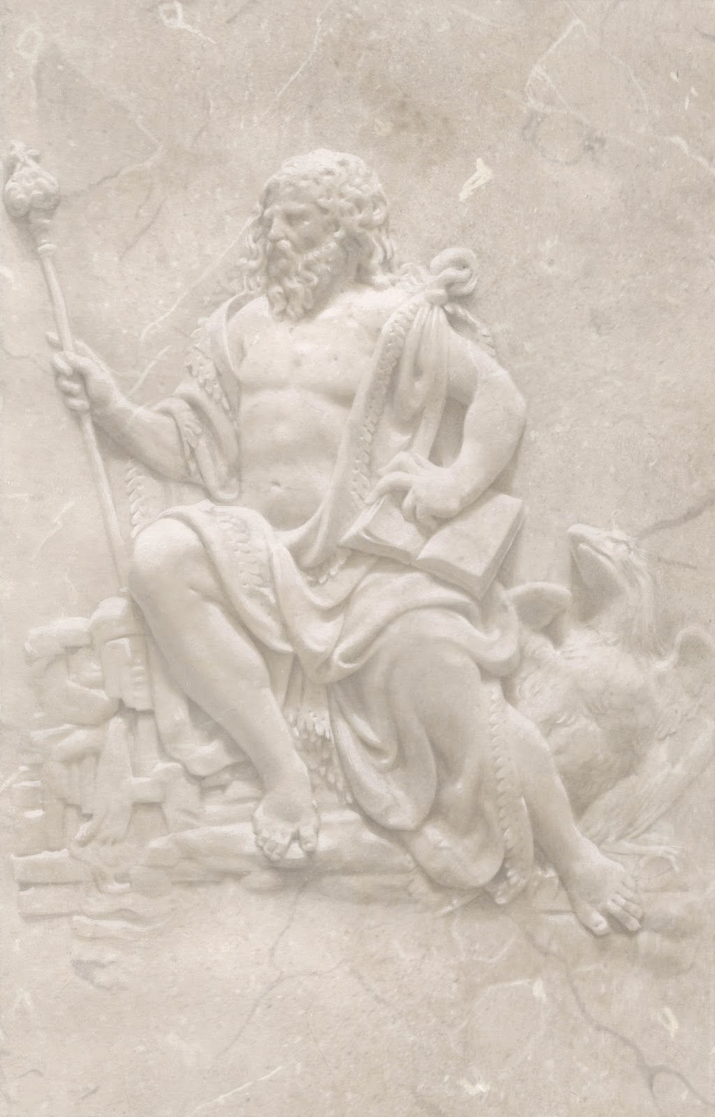
Finished.

To give you an idea of how light/dark my values are, here is a chart that shows you (below)...


Along the top you see 3 swatches of color. These represent averaged tones taken directly from the finished piece. Directly underneath them, you see 3 grey values (A, B, and C). These are the same colors from the top line desaturated so as to see value only. Below that, I plotted A, B, and C against the Munsell value chart. You can see that the entirety of my painting occupies roughly three value steps on the Munsell chart (from 6 to 9). No white, and nothing at all on the lower half of the chart.

Some more detail photos...


Wednesday, July 13, 2016

Fractal Geometry in African Villages: Lessons from an Outsider

In the 1960s, the Italian architecture firm Superstudio proposed the eradication of all architectural difference under a ubiquitous grid that they called a "Model for Total Urbanization." This is one of their posters.

"The exception proves the rule." How many times have we heard that without really understanding it? It was Cicero in ancient Rome who first said it, and what he implied was that exceptions presuppose the existence of a norm (to which they are the exception). We always look to outsiders, the exceptions to the rule, to help define ourselves as normal. Outsiders have always defined insiders. An old military adage says that you need a great enemy to create a great army. For ancient Greece, it was the Spartans and Macedonians who provided the "savage" exception that proved the superiority of the civilized Athenian polis, or city-state. For the West, a monstrous "other" occupying the rest of the world provided evidence of the dubious superiority of its own worldview.

The Western gridded "ideal city," as imagined by Fra Carnevale

In popular imagination, the exceptions to Western civilization still represent everything uncivilized, chaotic and savage in the world. When Edward Said and Claude Levi-Strauss came along in the '60s and pointed out that, hey, just because other cultures are different doesn't mean that they are devoid of their own internal logic and structure, we began to open our eyes to the fact that maybe, in the end, we had something to learn from "them." We'd gotten so blind to the veil we've fabricated as a frontier between city/country, order/chaos, insider/outsider, West/Rest, that we'd lost sight of the fact that ours is just one of many ways of being in the world, and that the veil is an illusion.

Somewhere in America

Case in point: the gridded and bordered modern city that sprang up in Europe towards the end of the Roman Empire - with its straight lines and corners retained by a circumscribing wall - quickly became the template for Western life. They were initially walled defensive positions (called Oppida), but the Romans soon became aware of their greater (in the long run) symbolic significance: The walled city is a locus of power. Those outside the walls were the medieval "wildmen," or savages beneath consideration. It established a clear - if fictional - boundary between the order of Man and the chaos of Nature.


The Universe is Euclidean, its rigid geometry tells us. The very linearity of modern cities came to represent the mythic Western advancement from barbarian to citizen, from chaos to order. The more squared-off the space, the more civilized its occupant. The barbarians lived outside the polis amid the chaos of nature, and "Nature," as Katherine Hepburn reminded Bogart in African Queen, "is what we are put in this world to rise above." Consequently, linear gridded space became the Western standard.

Hardly a coincidence that Star Trek automatons, "The Borg," occupy a cube.

By the 15th Century, Linear Perspective gained favor as a way of reifying what had already become a pervasively geometric worldview, literally set in stone by the Romans.  Perspective appealed to rich patrons because it backed up their notions of the hierarchy of social power (think majestic cathedrals with impossibly soaring trompe l'oeil ceilings inspiring awe among the plebs). Artists of Europe clamored to learn the rules of Linear Perspective as a way of codifying a "civilized" worldview, which flattered their clients by portraying them as higher-order citizens. Even if anyone had been aware of another way of seeing the world, they wouldn't have cared for it. West is best, and all that.

Every day I walk the streets of New York City, I'm aware that to get across town means zig-zagging at right angles across an artificially imposed grid that by its very inorganicness was designed to position the works of man as superior to those of nature.

What would an alternative even look like? We're so used to what we've got that it's hard to picture it, but we don't have to: When the fractal geometry of African villages was "discovered" by the West, it provided the exception that exposed the tenuousness of the norm we've come to accept. Certain villages in Africa (such as Tiébelé on the Ghanian border) have been organizing themselves for centuries according to mathematical principles that were only discovered in the West in the 1900s.

The classic Mandelbrot fractal set

Whereas the Western gridded polis denies Nature by proposing space as a system of stackable finite blocks, fractal architecture suggests an unfolding of space according to principles of organic growth. Each unit of fractal geometry relates intrinsically to its neighbor, regardless of scale. There is no frontier, no hierarchy of space as in the West.

Fractal sets are everywhere in Nature

Fractal architecture could never produce a Versailles, for example, that so self-consciously set itself apart from the populace that surrounded it. The "self-similarity" of fractal geometric modules would preclude it. Western architecture relies on the grid as an exclusionary device - you are either inside or outside the square - but fractal architecture seems to suggest that we all have the same potentiality.


I always worry that I'm writing too much in blog posts, that they're too long (because who the hell reads blog posts?), so I won't be getting into the weeds about what fractals are, except to say that they began as an outlier set of mathematical rules once considered to be useless oddities - Euclid's outsiders.

The fractal architecture of Ba-ila village, in Southern Zambia

The realization that whole communities live according to a spatial map that is entirely different to ours was an eye-opener. Watch this TED talk (and buy the book) by this fascinating mathematician who traveled Africa on a Fulbright scholarship, standing on rooftops and recording the fractal geometry he saw all around him. And next time you're sitting at a traffic light, imagine a world that has no right angles.

Ron Eglash mapped the fractal set at the heart of community life for Ba-ila villagers

Tiébelé, Ghana

Sunday, May 31, 2015

Tutorial: How to paint trompe l'oeil gold beading


Creating the "gold" beaded molding above this painted curtain was a relatively simple affair. Because there are so many of them across the whole surface (of which you're only seeing a small crop here), it pays to simplify the technique so that you don't lose your mind or, more importantly, your money. Here's how I did it.


First, I used blue tape to section off the area I wanted to paint, and laid down a wash of yellow ochre toned down with some raw umber.


  Next, I striped along the top edge with a line made from cadmium yellow, yellow ocher and a drop of white, and along the bottom edge with a line of burnt sienna, burnt umber and a drop of yellow ocher.


 Then I cut a stencil. This will be for the dark areas between the beads.


 Use a stencil brush to pounce a dark color made from burnt umber, raw umber and ultramarine, repeating your stencil across the full length of the molding.


Here's how it looks after I take the stencil away (above).


I used a fine pointed brush to lay a stroke of burnt sienna and burnt umber along the left edge of each bead. Notice that my stroke is slightly inside and away from the bottom edge of each bead. This gives the illusion of a reflected highlight.


Then, I added a small stroke of titanium white with a hint of cadmium yellow for the bright specular highlight. It too is placed in and away from the top edge of the bead.


Lastly, I added a dab of cadmium red opposite the specular highlight, and removed the blue tape.


Here's a close-up of how the completed molding looked. You can see that I used a similar method (but different colors) for the grey tongued molding along the top. This technique is quick, and useful in many scenarios.

Sunday, March 15, 2015

Perspective drawings by V. Pellegrin, 1873, and Ernest Norling, 1929

Fig. 1

Okay, I get it. Perspective is boring. Especially arcane drawings from some 19th century manual by the Professor of Topography at some Military School. True, the text (which you can read here) is as thick and dense as Dermot Malone who beat me up when I was a kid, but the drawings are amazing. Take the first one (Fig. 1), for example.

It shows how to draw a square in perspective (lmno), a column in perspective (m1, n1, q1, p1), and how to draw shadows cast in perspective (v2, u2, p2) ... all in one tiny little drawing. Note that the shadows also recede. Not only do they stretch back towards the horizon, but they have their own distance point at F1, which is a theoretical point that would be way under the ground somewhere. You know where to place the shadows by marking the intersection points between lines going back from the column towards the horizon, and lines cast by the sun (above and behind) that pass through the top corners of the column (p1, q1, u1, v1) and recede to F1. Simples.

Now you can delete this email and go about your day. See you in another couple of months with some more useless info. Bye!


I admit; some might be a tad complicated. But they still look cool.

Continuing from Figure 1, this shows an obelisk in perspective and how to construct appropriate shadows.


Maybe these next ones are a bit easier to follow. They're by Ernest Norling from Perspective Made Easy (1929). Maybe I should have posted these first, but they're not as cool-looking as Pellegrin's. And besides, nobody's made it this far into the post anyway.