Showing posts with label grisaille. Show all posts

Wednesday, November 9, 2016

How to Paint the Figure in Trompe l'Oeil

Here is a detail from the finished painting, enlarged because I used very small brushes.

You can use any background you like. I used an old faux-painted limestone sample I had lying around, but you could just as easily do this on faux bois to imitate the look of carved wood. The only stipulation I'd make is that to get the best effect, your background should be no darker than mid-range on the value scale.

In the next image, you can see the brushes I used. One small pointy one, and another splayed out and busted one. When doing shadows, I'd paint with Mr. Pointy then stipple and soften with the busted one. I'm not very fussy about materials or brushes. When I was young, I used to read all those manuals and study hard to learn the "secret" materials that would give me the edge. The only secret, I learned, is your eyes.
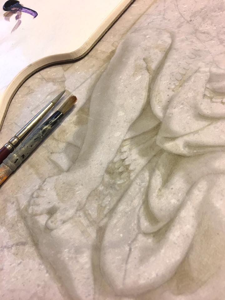


Step 1
 If you look closely in Step 1, you can just make out the pencil lines I used to establish the basic design. I took a photo of a bas relief panel at the Met as my reference. This is actually the first time I've used a photograph of actual relief as reference material. Mostly, I'm either inventing relief or copying another trompe l'oeil painter's work (who probably also invented the relief). This was a great chance for me to exercise Rule # 1 in illusionistic painting: Paint what you see, not what you know. 

It's all too easy to fall back on what we "know" about Form rather than simply using the evidence presented before our eyes. "Shadows are dark; highlights are white; reflected light goes here; etc." These are all learned rather than observed truths. [Painters use old tricks such as flipping their image upside down, or examining their work in a mirror, to escape the natural tendency to paint what we think we see.]

Step 2
Step 2 shows the completed shadows. There are no highlights at all here. You can see that the effect is 99% complete already. We could easily leave it like this, and call it a day.

I build the shadows very slowly using Ultramarine and Raw Umber acrylic paint, mixed with a little matte varnish (which dries quickly so I can keep working) as a medium.

The shadows are built up in layers. I never try to establish the darkest dark in the first pass. It's much more tentative then that. I build up darks in translucent glazes, always erring on the lighter side. I tend to work back and forth all over the image, as opposed to finishing each area completely as I go.

Step 3
Step 3 is my first pass at highlights. They might be hard to detect on your screen, as they are very subtle, but they are there. I used an opaque white, mixed with yellow and a little purple. I've heard that some people like to shift the hue of their highlights in opposition to the background color in order to make them pop more. [In other words, if the background hue is yellow (as with mine), they might shift their highlights into purple so that they jump out at you.] I don't do this. I use a lighter value of the background.

Use highlights very sparingly! As subtle as mine might look to you, when I look at the opening detail image of this post, the highlights jump out at me as being too strong and brushy. The image looks like it's been dusted with snow.  The shadows are soft and muted, as they should be, but the highlights are harsh, overused and overly delineated. We want to avoid this at all costs. (It was too late for me).

Step 4
 In Step 4, the only difference is that I carefully glazed the chest, top of the head, and the right knee with a second highlight. I decided that those three areas should be a little more prominent than they were.

It will be easier to see the differences between stages if you view these images in slideshow mode, and scroll between them.
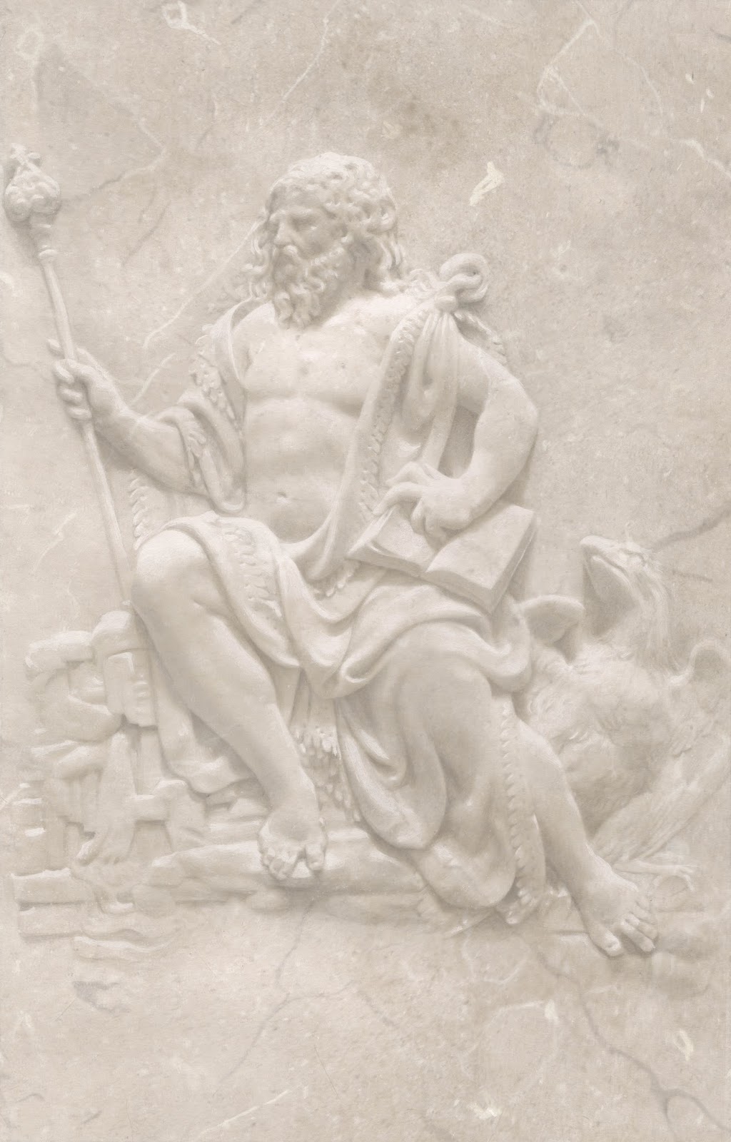
Step 5
 Step 5 might be hard to see, but I think it made a difference. Since all my highlights were already laid down, the only way I could make the relief pop a little more was by darkening the background. I explained the reasoning behind this in a separate post about relative value, here.

I certainly didn't want to add any more highlights, as mine were already too bright. Instead, I used a very washy ultramarine/raw umber glaze and stippled it all around the top right corner, outside the main figure.

I also used a glazed version of my highlight color and subtly lightened the bottom left corner (again, outside the figure only).

Finished.

To give you an idea of how light/dark my values are, here is a chart that shows you (below)...


Along the top you see 3 swatches of color. These represent averaged tones taken directly from the finished piece. Directly underneath them, you see 3 grey values (A, B, and C). These are the same colors from the top line desaturated so as to see value only. Below that, I plotted A, B, and C against the Munsell value chart. You can see that the entirety of my painting occupies roughly three value steps on the Munsell chart (from 6 to 9). No white, and nothing at all on the lower half of the chart.

Some more detail photos...


Thursday, February 7, 2013

Christophe Huet, Singeries at the Hotel du Rohan


Famous for his magnificent monkey paintings - known as Singeries - Christophe Huet painted this extraordinary set of panels for the Hotel du Rohan, in Paris. Popular to this day, these cheeky and occasionally racy anthropomorphic painted scenes of monkeys cavorting in human garb were hugely fashionable in Eighteenth Century France.


Though Berain and Audran were justly as famous in their day, Huet has perhaps been better remembered because of the quality of his surviving examples at the Chateau de Chatilly. Bertrand du Vignaud, head of the World Monuments Fund in Europe, says, “I consider the Grand Singerie the most important décor in the chateau,” claiming that “It is Huet’s masterpiece."


I was thrilled to come across this practically unknown set of phototype plates of his Cabinet des Singes for Rohan from a volume called Les Vieux Hotels de Paris, printed in 1905. One of a series of large folios containing beautiful prints, these books were an attempt to archive surviving examples of interior and exterior decoration around Paris at the turn of the 20th century.


His work at the Hotel du Rohan is lesser known than Chantilly, but deserves recognition. Originally built in 1705, and home to successive cardinals and bishops, Huet's Rohan panels were eventually commissioned some time around 1750 by the Cardinal de Soubise, who gave the Hotel (by which term they mean mansion) a complete transformation. According to the book Debut de l'Imprimerie en France, Huet was assisted in painting the panels by Dutour, who painted the animals, and Crespin, who painted the landscapes. Huet is said to have painted the "flowers," by which I am assuming that means to include the ornamental borders and frames.


Those were heady times, to be sure. Marie Antoinette would regularly come poncing by for some cake with her entourage, before the whole party went tits up. Then, during the Revolution, it was placed into receivership and all its furniture and magnificent library were scattered to the winds. Later, after Napoleon had acquired it, the National Printing Press settled into it as their plush new 10,000 square meter HQ. It was eventually left to the National Archive in 1927, when Robert Danis was responsible for the gargantuan task of restoring the mansion to its former glory. Years of abuse, including the stripping out of the grand staircase to accommodate printing offices, left it a shell of its former self. Despite extensive efforts, much of the old decorations have not survived.


The panels have that unmistakable Huet look. His linework when seen up close and in black & white, has  the quality of an engraving that's received washes of color.


Friday, November 9, 2012

Focus, Dammit!


Do we even know why we do things? How many times have I said I can't do something when what I really mean is that I don't want to. It comes down to lack of awareness. 

So, why can't you meet me? 
"Because I have to take my cat to the vet". 
What'll happen if you don't take the cat to the vet? 
"It'll crap on the bed and my girlfriend will hate me." 

Okay, so you've weighed the consequences and chosen not to meet me. There's a clear distinction here between "I have to" (meaning I have no power) and "I choose not to" (meaning I have power). We make unconscious choices in our painting practice too. 


The awesome Dan Witz

For example, we could choose to go totally nuts on a portrait and paint every last pimple and split end on Angelina Jolie's head (she must have at least one), but why bother? I mean that honestly. Fine if you do that, but know why you've chosen to. Personally, I'm impressed by photorealism from a strictly technical standpoint, but I've little interest in it artistically. I choose to paint more loosely (or maybe I just can't paint that well). But the point is that anything short of exact duplication of nature is a deliberate choice, so why choose to paint loosely in this or that passage and tightly in another?


Bellini's painting of St. Francis in the Desert coming out of his cave in utter rapture is a great example. I've stared at this painting so many times, and it's crystalline clarity still makes me dizzy. Every element in the painting is given equal focus and attention to detail. In this instance, the technique serves the painting. Bellini made a deliberate choice to spend a bazillion hours painting every last blade of grass. But why?


St. Francis has clearly spent some time in this hermitic barred cage. His back to the sun, head buried in the Book and surrounded by the trappings of Man, his awareness of the world outside is like that of Plato's cave; limited to shadows cast on the walls. 

Bellini depicts the Moment of Clarity beautifully, where St. Francis turns around and seems to experience the world and the glory of it's creation for the very first time. Leaving his cane and sandals in the cave, he walks out and appears to scrunch his toes in the gravel (who doesn't love walking on sand for the first time in summer?), almost frozen in awe with arms wide open to the  world. he almost seems skewered on a sunbolt. It reminds me of the old shamanic vision quest. There's something distinctly hallucinogenic about the landscape, and it's one of the most powerful paintings I've ever seen.


Camille Corot

Or on the other hand maybe you like the soft landscapes of Corot and might choose to paint like that, where everything is blurred, hazy and romantic. The decision doesn't have to be an overall one. You could choose to manipulate the softness of individual edges within your composition, based upon your idea for the painting. Some amount of softness makes for charm, and is extremely popular.

"Corot developed a treatment (of) looking at trees with a very wide focus. He ignored individual leaves, and resolved them into masses of tone, here lost and here found more sharply against the sky. Subordinate masses of foliage within these main boundaries are treated in the same way, resolved into masses of infinitely varying edges. This play, this lost-and-foundness at his edges is one of the great distinguishing charms of Corot's trees." [source]


Vermeer, Milkmaid (detail)
Vermeer created the softest red haze around his painted flesh which makes it seem to glow. Everything is ever so slightly out of focus, perfect for those dusty, quiet interiors.


Hans Holbein, The Ambassadors (detail)
Hans Holbein rendered textures beautifully, but distinctly and with tightly bound outlines which makes them stand alone in his compositions. Whether we choose to leave the whole painting or even just a particular edge blurred or in tight focus is a matter of personal preference, but should be a conscious one. 


From the laws of human attraction to the kind of landscape we like to lay down our blanket and picnic in, there’s an innate human need for mystery. Don’t spell every last detail out for me; let me search for it. I do the same thing with my cat when I stick a treat into a rubber ball and let her find a way to get it out. We’re simple creatures, after all. J. R. R. Tolkien called it "that shimmer of suggestion that never becomes clear sight, but always hints at something deeper, further on."

Tuesday, October 23, 2012

Xavier Mader, Piat Sauvage, and Reflected Light


CGI studios have a standard trick used for establishing the reflected light on digitally created images for movies. A large mirrored or matte ball on a stick is placed prominently in the shot. They use this because the ground and sky are not always visible in the finished shot, but CGI artists need to know the color of each so that they can correctly judge the reflected light cast on the digitally created element in the shot.

RGB readings (above) from a matte-finished grey reference globe positioned in the set give accurate colors and lighting positions for CGI artists to base their digital 3D paintings upon. You can see from the six RGB numbers taken from this photo that there is a lot of information to consider regarding light, either reflected or direct.

Still frame of test ball flying through cavern in Lord of the Rings

In the still from WETA Workshop (above) “the ball is lit by a blue light from above, and a weaker orange light from below. During the test video, the lighting changed throughout the course of the fly-through. If you wanted to animate a digital creature flying into those caverns, the forms of the creature would have to respond to the same lights that are lighting the gray ball. Digital lighters can unwrap the data from the gray ball or the mirror ball into a spherical environment map.” [Source]

The good news as far as illusionistically painted architecture is that we don’t concern ourselves with this level of detail. It’s good to understand the reality, but it would take way too long to paint. For the most part, reflected light is rendered in one tone only. In fact, simply leaving the mid-toned background showing along a crescent strip – and not adding any extra painted step - often suffices for the representation of reflected light on architectural ornamentation. Decorative painting is all about developing shorthand, and any step that can be cut out means less time spent (and more money in your pocket).

The standard rule for reflected light is that the lightest dark in the shadows should never be lighter than the darkest light in the lights. It sounds confusing at first, but it makes sense if you think about it. There is a tendency to overdo reflected light. Sometimes the reflected light looks too bright, and the successful modeling of form is compromised. Generally speaking, keep any reflected light relatively dark.

An Allegory, by Piat Sauvage

Piat Sauvage was a master at painting grisaille bas-relief imités, but his use of exaggerated reflected light on the right side of the naked woman in “An Allegory” (above) illustrates my point. The overly emphasized light bouncing back onto the legs and torso [from what source exactly?] ruins the illusion of three-dimensionality, and gives the game away that it is paint, not plaster, that we are looking at.

Section of woodblock printed wallpaper, by Xavier Mader
The section of molding in the wallpaper by Xavier Mader (above) demonstrates my point about reflected light as it is normally rendered in decorative painting. You can see that the area of reflected light is created by simply shifting the darkest shadow away from the lower edge of the ornament, leaving an area of dark mid-tone showing.

Monday, May 7, 2012

Why Robert Adam used Stucco and Paint


There was a very simple reason why the great British architect Robert Adam used Stucco and Paint instead of tapestries and upholstery when designing Dining Rooms such as this one in Lansdowne House: So the smell of roast suckling pig wouldn't hang in the room.

"The eating rooms are considered as the apartments of conversation, in which we are to pass a great part of our time. This renders it desirable to have them fitted up with elegance and splendor, but in a style different from that of other apartments. Instead of being hung with damask, tapestry & c. they are always finished with stucco, and adorned with statues and paintings, that they may not retain the smell of the victuals."


Friday, March 2, 2012

Raphael Loggia Ornament


What's the most fun you can have without a King-sized bed and a rubber chicken? Yep, you guessed it: I just spent a day studying an original set of hand-painted engravings from 1770 of Raphael's designs for the painted ornament for the loggia at the Vatican.

It took three of us just to carry the first volume onto the viewing table. This thing looked like the Queen Mary hoving into view. Raphael himself could have delivered it on a unicorn and I'd be no more impressed. It was the most awesome object I've ever seen.


Three volumes, (the first of which measured about 24" x 36"), meticulously engraved, and subsequently painted in vibrant gouache of Raphael's panel, ceiling and pilaster designs for the Vatican in a riotous mixture of earthy fauna, gauzy maidens, beardy gods and grotesque ornament of every imaginable type.


Can somebody please explain the Universe to me, because I'm a little confused: How is it that one of only three complete sets in the world of these spectacular engravings can sell in November of last year for only $25,000, when Damien Hirst can sell horse manure for a million? It makes me so mad. And why am I finding out four months too late? I would have gladly cashed in my daughter's college fund if I'd known.


"The loggia, or colonnaded porch, on the second story of the Apostolic Palace is one of the Vatican’s most remarkable art treasures; its decoration, designed by Raphael (1483—1520) and executed by his workshop in 1517- 1519, epitomizes the spirit of the Italian Renaissance in its synthesis of Christian and classical themes. The thirteen square vaults of Raphael’s loggia each contain four frescoes of scenes from the Bible, from the Creation to the Last Supper." [source] 


Noah's Ark scene from the Vatican loggia...
... and the same scene as depicted in the set of engravings
"These splendid, large-size copperplate engravings, from the suite Le Loggie di Rafaele nel Vaticano (Rome: 1772-77), after the celebrated frescoes by Raphael in the loggia of the Vatican, are scarce, with OCLC recording only two complete copies in libraries worldwide.

"The Raphael Loggia consists of thirteen arches forming a gallery sixty-five meters long and four meters wide. Its construction was begun by architect and painter Donato Bramante in 1512, under Pope Julius II and was completed by Raphael under the reign of Leo X. Raphael began work on the frescoes in 1517.


"The plates, designed by P. Camporesi, G. and L. Savorelli Teseo and engraved by G. Volpato (1733-1803) and G. Ottaviani (1735-1808), depict, in a vibrant color gouache, the pilasters, paneling, ceiling panels and two doorways with floral, figural and architectural motifs. Where human figures in the original frescoes were compromised by weathering and erosion, engravers Volpato and Ottaviani replaced them with elements from the Vatican tapestries designed by Raphael.


"While Raphael's Vatican frescos were admired in their time, they were ultimately overshadowed by the work of Michaelangelo until the Neoclassicists of the eighteenth and nineteenth centuries rediscovered the Renaissance, and Raphael earned his place as the era's greatest artist of them all.

""Raphael is categorically the greatest painter of the last millennium, and the Loggia is his most significant legacy," says Antonio Paolucci, director of the Vatican Museums and esteemed art historian.


"And yet the Loggia is the least known of Raphael's works. Millions of visitors to the Vatican Museums pass by it every year, but cannot go inside. Looking from Saint Peter's Square, it is in the second of the three glassed-in hallways across from the building in which the pope resides. When it was constructed, in the early part of the sixteenth century, it overlooked a garden. The thirteen arches of the Loggia frescoed by Raphael were not enclosed in glass until the nineteenth century. Originally, they were open to the luminous Roman sky, which made their colors even more brilliant" (Sandro Magister, Chiesa Espressonline)."

[source]

It has been notoriously difficult to find any images of Raphael's loggia work - the fact that the loggia are closed to the public and sealed behind glass has not helped - but Abbeville Press has published what looks like a fine book on the subject.