
 |
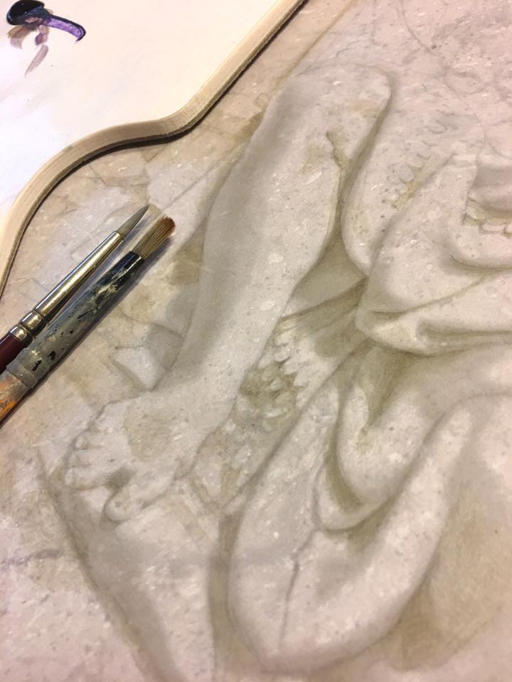
| Here is a detail from the finished painting, enlarged because I used very small brushes. |
In the next image, you can see the brushes I used. One small pointy one, and another splayed out and busted one. When doing shadows, I'd paint with Mr. Pointy then stipple and soften with the busted one. I'm not very fussy about materials or brushes. When I was young, I used to read all those manuals and study hard to learn the "secret" materials that would give me the edge. The only secret, I learned, is your eyes.
 |
| Step 1 |
It's all too easy to fall back on what we "know" about Form rather than simply using the evidence presented before our eyes. "Shadows are dark; highlights are white; reflected light goes here; etc." These are all learned rather than observed truths. [Painters use old tricks such as flipping their image upside down, or examining their work in a mirror, to escape the natural tendency to paint what we think we see.]
 |
| Step 2 |
I build the shadows very slowly using Ultramarine and Raw Umber acrylic paint, mixed with a little matte varnish (which dries quickly so I can keep working) as a medium.
The shadows are built up in layers. I never try to establish the darkest dark in the first pass. It's much more tentative then that. I build up darks in translucent glazes, always erring on the lighter side. I tend to work back and forth all over the image, as opposed to finishing each area completely as I go.
 |
| Step 3 |
Use highlights very sparingly! As subtle as mine might look to you, when I look at the opening detail image of this post, the highlights jump out at me as being too strong and brushy. The image looks like it's been dusted with snow. The shadows are soft and muted, as they should be, but the highlights are harsh, overused and overly delineated. We want to avoid this at all costs. (It was too late for me).
 |
| Step 4 |
It will be easier to see the differences between stages if you view these images in slideshow mode, and scroll between them.
 |
| Step 5 |
I certainly didn't want to add any more highlights, as mine were already too bright. Instead, I used a very washy ultramarine/raw umber glaze and stippled it all around the top right corner, outside the main figure.
I also used a glazed version of my highlight color and subtly lightened the bottom left corner (again, outside the figure only).
Finished.
To give you an idea of how light/dark my values are, here is a chart that shows you (below)...

Along the top you see 3 swatches of color. These represent averaged tones taken directly from the finished piece. Directly underneath them, you see 3 grey values (A, B, and C). These are the same colors from the top line desaturated so as to see value only. Below that, I plotted A, B, and C against the Munsell value chart. You can see that the entirety of my painting occupies roughly three value steps on the Munsell chart (from 6 to 9). No white, and nothing at all on the lower half of the chart.
Some more detail photos...


Nice! Thanks, I needed that today.
ReplyDeleteRecording success in Cryptocurrency, Bitcoin is not just buying and holding till when bitcoin sky-rocks, this has been longed abolished by intelligent traders ,mostly now that bitcoin bull is still controlling the market after successfully defended the $20,000 support level once again and this is likely to trigger a possible move towards $40,000 resistance area However , it's is best advice you find a working strategy by hub/daily signals that works well in other to accumulate and grow a very strong portfolio ahead. I have been trading with Mr Bernie doran daily signals and strategy, on his platform, and his guidance makes trading less stressful and more profit despite the recent fluctuations. I was able to easily increase my portfolio in just 2weeks of trading with his daily signals, growing my $5000 to $55,000. Mr Bernie’s daily signals are very accurate and yields a great positive return on investment. I really enjoy trading with him and I'm still trading with him, He is available to give assistance to anyone who love crypto trading and beginners in bitcoin investment , I would suggest you contact him on WhatsApp : + 1424(285)-0682 , Gmail : (BERNIEDORANSIGNALS@GMAIL.COM) or Telegram : @berniedoransignals for inquiries , Bitcoin is taking over the world
DeleteINTERNET SCAM ALERT‼️
DeleteThe internet today is full of SCAM ADS, mostly in comments of various sites and blogs. A large number of individuals have been victims of scam and lost a lot of money to SCAMMERS. Most of the common scam you can see are -:
❌BANK LOAN SCAM. ❌BINARY OPTIONS SCAM.
❌MONEY MULTIPLICATION SCAM. ❌HACKING SCAM. ❌GETTING DEGREE SCAM. ❌SHOPPING SCAM and lost more..........
But here is a good news to everyone who has been a victim of INTERNET SCAM❗️
You can get your money back from the scammer, and can even get more than what you lost, No Authorities will not been involve just the genius of our skill.
WHO ARE WE⁉️
We are PYTHONAX ! A group of skilled Hackers who have dedicated our time to helping individuals to get back thier money from INTERNET SCAMMERS. A research was carried out and an approximation of more than $3billion USD annually was said to be lost to INTERNET SCAM. This is so wrong and that’s why we have decided to help individuals get thier money.
HOW DO WE OPERATE⁉️
We use a RAT(Remote Access Trojan) to take over the SCAMMER(s) device(Phone or Computer) and take back your money by accessing their Bitcoin wallets or Bank Account. Most of this scammers use their Bitcoin to save money they get from SCAM activities. This is because Bitcoin keeps the money hidden from FINANCIAL INSTITUTIONS BOARD from getting to see the money they can’t give account for.
If you have been a Victim of INTERNET SCAM, then you should contact us via the Email below
Email-: pythonaxservices@gmail.com
pythonaxhacks@gmail.com
DeleteSELLING SSN FULLZ | REAL DLS F\B | NIN SIN WITH DOB | BUSINESS EIN COMPANY |
SSN DOB | FULL INFO ON SSNDOB | REAL DL Fullz with Issue & Exp Dates | NIN DOB ADDRESS | BUSINESS EIN COMPANY
Passport Photos with Selfie | High Credit Scores | DL FOR COINBASE | SSN SIN SPAMMED & VERIFIED
For more infos DM
telegram @Albertz10
>SSN FULLZ USA REAL DOCS ID|DL FRONT BACK
>DL FULLZ MVR
>UK NIN DOB ADDRESS SORT CODE FULLZ
>UK NIN DOB DL ADDRESS MMN INFO PROS
>UK CANADA RUS FR IT GR DL|ID FRONT BACK WITH SELFIE
>PASSPORT PHOTOS WITH SELFIE
>BUSINESS EIN COMPANY FULLZ PROS
>YOUNG & OLD AGE FULLZ
>HIGH CREDIT SCORES PROS FULLZ
>SSN DOB DL FULLZ WITH ISSUE & EXPIRY DATES
>DEAD FULLZ UK USA CANADA
>CC WITH CVV
>PAYDAY LEADS
>Verified Email Database
>HOME OWNER LEADS
>EMPLOYEE Leads
> FOREX DATABASE
>DUMPS WITH PIN TRACK 101 & 202
>DATA FOR TAX RETURN
>AMAZON Database
>CRYPTO LEADS
>DATA FOR TAX RETURN
>TUTORIALS
> TOOLS
For more infos DM
telegram channel https://t.me/LeadsSellers
***Benefits***
-LOAN
-DATA FOR TAX RETURN
-AMAZON
-TUTORIALS
For more infos DM
whats app +44 7700 137680
#fullzprosleads #usaleads #UKFULLZ #CANADAFULLZ #BTC #ETH #CRYPTOCURRENCY #MAGA #SWEEPSTAKES #DEADFULLZ #OLDAGEFULLZ #TAXRETURN #CRYPTOLEADS #SINFULLZ #CANADAFULLZ #CC #DUMPS #SSNDOB #usaleads #UKFULLZ #CANADAFULLZ #sindob #ccfullz #dumps #ssnfullz #dlphotos #USA #SAVENATURE #HACKING #SELLER #VENDOR
Yes thank you! I was certainly in need of something like that today as well! Very good example showing your technique , and especially your skills regarding values, and tone. Cheers!
ReplyDeleteIan
Arthur Pope's classic treatise
ReplyDelete"Tone Relations in Painting"
Online for Free!
An oldie but a goodie:
https://archive.org/details/cu31924016785028
I hadn't seen it! (Or heard of it - oops). But this made me really happy to see, and that you shared.
DeleteCheers.
Excellent work Alan , as always , beautifully painted and clear explanations!!!! Bravo!!
ReplyDelete
ReplyDeleteEncontre esta pagina, buscando ideas, pues e decidido ponerme a fabricar puertas talladas y tratadas a mano.
Que hermosuras mas grandes, puede llegar a crear, los hombres de bien.
<<Investing on the cryptocurrency market has been a main source of income, that's why knowledge plays a very important role in humanity, you don't need to over work yourself for money.All you need is the right information, and you could build your own wealth from the comfort of your home!Binary trading is dependent on timely signals, assets or controlled strategies which when mastered increases chance of winning up to 90%-100% with trading. It’s possible to earn $10,000 to $20,000 trading weekly-monthly in cryptocurrency(bitcoin) investment,just get in contact with Mr Bernie Doran my broker. I had almost given up on everything about binary trading and never getting my lost funds back, till i met with him, with his help and guidance now i have my lost funds back to my bank account, gained more profit and I can now trade successfully with his profitable strategies and software!!
ReplyDeleteReach out to him on Telegram: @bernie_fx or WhatsApp : +1(424)285-0682 for inquires
BITCOIN RECOVERY TESTIMONY
ReplyDeleteI fell victim to a scam online a few days back and lost about $20,000 usd to a fake trading platform online. I was heartbroken and I really needed help so I contacted a friend who linked me with a group of experts. I really did not believe I could recover my lost funds but thanks to JETWEBHACKERS They helped me within a space of 5 working days recover all my scammed funds including all my profits from the scam company. I am forever grateful and I hope people in my shoes get the help they need as well. Contact JETWEBHACKERS for more information.
Quickly reach out to JETWEBHACKERS, on their
EMAIL:jetwebhackers@gmail.com
TELEGRAM: @jetwebhackers
My process for recovery has been kind of a bumpy process because of the fake recovery agents I encountered. However with the support given to me by RIGHT WAY LAW RECOVERY SERVICES, I have collectively succeeded in recouping my locked up BTC Assets valued at $326,790 within the space of 48 hours !! Or rather the team worked hard on my behalf, I only had to provide them with a few details regarding my investment with the fraud company and they did the rest for me. Prior to meeting RIGHT WAY LAW RECOVERY FIRM, I had met a few recovery agents as well, that only seemed to care about their service fee similar to what the fraud company was doing to me and at some point I almost gave up the believe that I would ever get back my money but today I’ve done full circle to come back here and give my own thankful review since I learnt about the team through the many reviews on here. I feel ready to take on the world with my new found awareness and RIGHT WAY LAW RECOVERY on my team! … I wish they would create more awareness platforms and opportunities to help enlighten more people about crypto and how best to navigate the digital financial landscape, this will surely help to reduce the fast spreading fraudulent activities going on here & there and save potential investors from falling prey!. Glad I know it now and I can teach it to my children so they wont make the same mistakes I did. You can also contact them via their official email address: RIGHTWAYLAWRECOVERYSERVICES@GMAIL .COM OR Telegram :+ 1 513 602 3179
ReplyDeleteINTERNET SCAM ALERT‼️
ReplyDeleteThe internet today is full of SCAM ADS, mostly in comments of various sites and blogs. A large number of individuals have been victims of scam and lost a lot of money to SCAMMERS. Most of the common scam you can see are -:
❌BANK LOAN SCAM. ❌BINARY OPTIONS SCAM.
❌MONEY MULTIPLICATION SCAM. ❌HACKING SCAM. ❌GETTING DEGREE SCAM. ❌SHOPPING SCAM and lost more..........
But here is a good news to everyone who has been a victim of INTERNET SCAM❗️
You can get your money back from the scammer, and can even get more than what you lost, No Authorities will not been involve just the genius of our skill.
WHO ARE WE⁉️
We are PYTHONAX ! A group of skilled Hackers who have dedicated our time to helping individuals to get back thier money from INTERNET SCAMMERS. A research was carried out and an approximation of more than $3billion USD annually was said to be lost to INTERNET SCAM. This is so wrong and that’s why we have decided to help individuals get thier money.
HOW DO WE OPERATE⁉️
We use a RAT(Remote Access Trojan) to take over the SCAMMER(s) device(Phone or Computer) and take back your money by accessing their Bitcoin wallets or Bank Account. Most of this scammers use their Bitcoin to save money they get from SCAM activities. This is because Bitcoin keeps the money hidden from FINANCIAL INSTITUTIONS BOARD from getting to see the money they can’t give account for.
If you have been a Victim of INTERNET SCAM, then you should contact us via the Email below
Email-: pythonaxservices@gmail.com
pythonaxhacks@gmail.com
Real PayPal hack transfer $64,560
ReplyDeleteI'M FOREVER GRATEFUL TO JETWEBHACKERS FOR HE IS THE BEST HACKERS IN THE WORLD , I SUCCESSFULLY RECEIVED $64,560 FROM THEM, THROUGH HIS UNLIMITED SERVICES ,WHICH I WAS ABLE TO PAY FOR MY SICK MOM HOSPITAL BILLS AND OTHER BILLS WHICH WAS CAUSING ME DEPRESSION ,I AND MY FAMILY SAY A BIG THANK YOU TO YOU GUYS FOR YOUR KINDS AND GENER0US WORK
THEY ARE REAL!!
CONTACT: (Jetwebhackers @gmail com)
TELEGRAM: jetwebhackers
You can also contact them for the service below
* Western Union/MoneyGram Transfer
*Recover Stolen/Missing Crypto/Funds/Assets
* Bank Transfer
* PayPal / Skrill Transfer
* Crypto Mining
* CashApp Transfer
* Bitcoin Loans
you ever need the help of a hacking personnel contact ethicalhackers009@gmail.com or whatsapp +14106350697 for all your hacking or pi jobs they are relible and eficient they helped me hack into a server got my stolen cryptocurrency out for me how they did it, but i am glad i hired them, contact them and thank me later
ReplyDeleteSELLING FULLZ UPDATED-2025 VERIFIED & VALID
ReplyDeleteTele Gr@m - (at) killhacks / (at) leadsupplier
What's App - (+1).. 727... 788..... 6129..
Skype - (at) peeterhacks
E mail - exploit.tools4u at gmail dot com
USA UK CANADA GERMANY RUSSIA AUS Fullz info available
SSN fullz with Dob address & DL info
Original/Real DL Scan Front back with selfie Many Countries
High Credit Scores Pros 700+ scores
Young age fullz 2010 upward
Old Age Fullz 1960 Below
Passport Photos with selfie
KYC & Tax return filling Fullz
UberEats|Doordash|shoplyft|FASFA Fullz database Fresh
Specific Info fullz you can get as well
Filter DOB|City|State|Gender|Zip codes Fullz
CC with CVV & billing Address
Dumps with Pin Track 101 & 202
Tools & Tutorials are available as well
Tutorials for Loans|CC cashout|Carding Methods
SMTP|RDP|C-Panels Available with working guarantee
Web-Mailers|Shells|Bulk Email Sender Tools
Tutorials for dumps cash out
Tools for Sp@mming|Carding|Scripting available
Sc@m Pages with Sc@m Page scripting
Many other powerful Tools available
Each tool will be provided with working guarantee
No sampling for CC's & ID|DL scan's
Only info samples will be provided in txt or excel format
Bulk quantity fullz available with market competitive prices
Available 24/7 in all time zone's
Fresh & unused stuff will be provided
Used|Invalid|Bad|Wrong|Mis Match info will be replaced
For Queries & Inquiries
We're available here:
What's App - (+1).. 727... 788..... 6129..
Tele Gr@m - (at) killhacks / (at) leadsupplier
Skype - (at) peeterhacks
E mail - exploit.tools4u at gmail dot com
Hello everyone I want to use this Medium to say big thank you to Seeker Assets Recovery for they helped me recover my stolen crypto worth $119,000 through their hacking skills I tried it I was skeptic but it worked and I got my money back, I’m so glad I came across them early because I thought I was never going to get my money back from those fake online investment websites .. you can also contact them via
ReplyDeleteEmail: info @ seekerassetsrecovery . com
Website: seekerassetsrecovery . com
Whatsapp: +1 514 312 2803
I lost 200K after I was deceived into buying fake ICOs by a forex trader and it turned out I was being manipulated into buying nonexistent coins.
ReplyDeleteI would advise everyone who intends to go into crypto trading to be wary and avoid these people who pretend to know it all and claim to be forex managers who are only out to steal from you. I’m grateful for the intervention of Morphohack Cyber Service, who was able to help me detect this was a Fake ICO and told me how they were creating these fake and worthless coins to convince their victims in other to steal from them, Morphohack Cyber Service was able to trace the crypto I sent to them to put into this platform, Morphohack retrieved my crypto funds and we reported the outcome of the investigation to the authorities. I strongly recommend Morphohack Cyber if you want to recover your crypto funds from these crypto scammers.
You can contact Morphohack via the following:
WhatsApp: (+12136724092)
E-MAIL:(Morphohack@cyberservices.com)
Thanks
Neil T. Stover
ReplyDeleteBIG DEALS $$$$
USA DATABASE-FULLZ-LEADS ( updated upto 2025 - All info is verified & guaranteed )
***********************************************************************************
We'Offering SSN DL USA/UK/CA/AUS/EU/ASIAN/INTER CC/CVV FULLZ INFO, Valid Non-VBV Bin Fullz CCV...
We guarantee that Our INFOS 100% firsthand and extremely fresh because we update them weekly and monthly.
Fresh stuff available here only
BIG discount on bulk
Invalid & useless info will be replaced
#USA--#UK--#CANADA STUFF
*************************
-SSN DOB DL Address
-SSN DOB DL Address Phone email
-Real DL|ID Front Back with Selfie & SSN
-High Credit scores Pros 700+
-Young Age fullz 2010 & above
-Old Age fullz 1960 & below
-Passport Photos with Selfie
-Fresh Sweepstakes & Payday Leads
-KYC & Tax Return Stuff
-W2 Forms with DL front Back
-Cars Database with Registration Numbers
-Work Travel Visa with SSN Photos
-CC with CVV with billing address
-Dumps with Pin Track 101 & 202
-Business EiN Pros FullZ
-UK Real DL Scan Front back with Selfie
-UK Passport Photos with Selfie
-Bulk UK Fullz
-UK young & Old age Fullz
-UK CC with CVV fullz
-High Credit Scores UK fullz Pros
-UK phone numbers & emails Leads
TOOLS:
Spamming Tools & tutorials
Web-mailers -Bulk Email Sender
Scampage tools and tutorials
Carding Tools & Tutorials
*******************************
Payment Method
* USDT * ETH * BTC* PAYPAL
***************************
#FULLZ #SINFULLZ#REALDLSCAN #YoungAgeFullz #Fullzseller #CANADAFULLZ
#FULLZCANADA #SellerSINDOB #ShopSINDOB#BusinessFullzCanada #CanadaPros
#CanadaLeads#HighCSPRos #HighCreditFullz #Fullzseller #UKFULLZ #FULLZUK
"Let's explore opportunities for a mutually beneficial, long-term partnership.
*********************************
Contact us :
Telegram: @Albertz101
Gmail: albertartemis six at @ gmail dot com
**********************************
Delete>>>> FULLZ DATABASE AVAILABLE<<<<
SSN DOB | FULL INFO ON SSNDOB | REAL DL Fullz with Issue & Exp Dates | NIN DOB ADDRESS | BUSINESS EIN COMPANY
Passport Photos with Selfie | High Credit Scores | DL FOR COINBASE | SSN SIN SPAMMED & VERIFIED
For more infos DM
Telegram @Albertz10 | Channel > https://t.me/LeadsSellers | Whatsapp +44 7700 137680 |
|SSN DOB | FULL INFO ON SSNDOB |
|REAL DL Fullz with Issue & Exp Dates |
|NIN DOB ADDRESS |
|BUSINESS EIN COMPANY|
|Passport Photos with Selfie |
|High Credit Scores |
|DL FOR COINBASE |
|SSN SIN SPAMMED & VERIFIED|
|SSN FULLZ USA REAL DOCS ID|DL FRONT BACK
|UK NIN DOB DL ADDRESS|
|CANADIAN & GERMANY INFOS |
|SIN DOB ADDRESS MMN PHONE |
|BUSINESS EIN COMPANY PROS |
|DEAD FULLZ |
|SWEEP STAKES |
|CC WITH CVV |
|PAYDAY LEADS |
|Verified Email Database |
|HOME OWNER LEADS |
|EMPLOYEE LEADS |
|FOREX DATABASE |
|DUMPS WITH PIN TRACK 101 & 202 |
|DATA FOR TAX RETURN |
|AMAZON |
|TUTORIALS |
| TOOLS |
SSN -LLC- PASSPORT- DL---UK LTD-DL----CANADA FULLZ----DL FOR COINBASE---AUS DL/PASSPORT
For more infos DM
Telegram @Albertz10 | Channel > https://t.me/LeadsSellers | Whatsapp +44 7700 137680 |
#FULLZPROS #USALEADS #UKFULLZ #CANADAFULLZ #BTC #ETH #CRYPTOCURRENCY #MAGA #SWEEPSTAKES #DEADFULLZ #OLDAGEFULLZ #TAXRETURN #CRYPTOLEADS #SINFULLZ #CANADAFULLZ #CCINFOS #DUMPS #SSNDOB #UKFULLZ #CANADAFULLZ #SINDOB #CCFULLZ #DUMPS #SSNFULLZ #REALDL #USA #SAVENATURE #HACKING #SELLER #VENDOR
สล็อต Online gambling service providers That answers all needs Excellent gambler 24 hours a day
ReplyDeleteI fell victim to a sophisticated cryptocurrency scam, losing $128,000.00 USDT to a fake trading platform. The scammers had promised a 10% daily profit, but instead, they left me financially ruined and struggling to pay my bills. Desperate for a solution, I confided in a close friend who introduced me to MORPHOHACK CYBER SERVICE, a team of experts specializing in cryptocurrency recovery. Their cutting-edge software and advanced techniques proved to be the game-changers I needed.
ReplyDeleteIf you're in a similar situation, don't hesitate to reach out to MORPHOHACK CYBER SERVICE at (Morphohack@cyberservices.com)
Their team is dedicated to helping victims of cryptocurrency scams recover their stolen funds.
MORPHOHACK CYBER SERVICE employed a multi-faceted approach to recover my stolen digital assets. Their team utilized:
• Advanced tracking software to identify the scammers' digital footprints
• Sophisticated algorithms to trace the flow of my stolen funds
• Expert analysis to uncover the scammers' tactics and vulnerabilities
Within an impressive 72-hour timeframe, MORPHOHACK CYBER SERVICE successfully investigated, tracked down the scammers, and recovered my stolen funds. Their prompt and professional service gave me hope in a desperate situation.
If you've fallen victim to a similar cryptocurrency scam, I strongly recommend reaching out to MORPHOHACK CYBER SERVICE. Their expertise and advanced techniques can help you recover your stolen funds and avoid further financial losses.
I made a costly mistake on Coinbase, sending $43,000 worth of Bitcoin to an incorrect address. The support team informed me that recovery was impossible. Desperate for a solution, I researched online and discovered Morphohack, a company with a proven track record in cryptocurrency recovery. I contacted them, providing transaction details and screenshots. To my surprise, Morphohack successfully tracked down my Bitcoin, which had been transferred to multiple micro wallets, and recovered approximately $39,800. If you've lost Bitcoins or other crypto due to a similar mistake, lost access to your crypto wallet, Morphohack Cyber Service may be able to assist you.
ReplyDeleteYou can reach them through their website www . morphohackcyber . com or other contact channels below
Morphohack@cyberservices. com
Info@morphohackcyber. com
As an accountant, I'm typically cautious with my finances. However, last year, I felt pressure to join the cryptocurrency market, fearing I'd miss out on potential gains. An Instagram ad for CBEX Trading caught my attention, with its professional website, real-time charts, and promising testimonials. A representative named Elena guided me through the platform, offering a $200 welcome bonus. Convinced by their promises, I invested $87,000 worth of Bitcoins.
ReplyDeleteBut when CBEX's website crashed, and all communication channels were severed, I realized I had been scammed. Devastated and lost, I searched for ways to recover my funds. That's when I discovered Morphohack, a reputable crypto recovery service. Their expertise and track record gave me hope.
Morphohack's team worked diligently to track down my stolen bitcoins and successfully recovered it from the CBEX scam. I'm grateful for their exceptional service and expertise. Thanks to Morphohack, I was able to recover my losses. If you've fallen victim to a CBEX/PCEX Scam, I highly recommend Morphohack's services.
Morphohack@cyberservices . com or visit www.morphohackcyberservices .com
Selling (USA-UK-CANADA) FULLZ/ LEADS/ DATABASE
ReplyDeleteHuge discounts on bulk order
Replacement for bad and invalid info
Payment in any Crypto
Stuff delivers after payment
Service 24/7
===============================
Contact us for deals and discounts:
@Lead_pro20-----Tele gram
(+1)- 605- 8461- 870…------What’s App
datatrader3(at)g-mail.com---------Email
===============================
(USA-UK-CANADA Fullz)
o SSN dob dl address employment bank info & routing number
o UK NIN dob dl address sort code
o sin dob address MMN phone email
o real dl scan front back with selfie & SSN
o SSN dob address phone email
o Passport photos
o Young & old age fullz
o EIN fullz
o Business owner leads
o Payday & personal loan leads
o First hit sweepstakes
o Casino leads
o Home owner leads
o Employee leads
o USA Bank leads
o Email, combos & phone number leads
o Crypto & forex leads
o Stock market leads
o Car’s data base with registration number
o Loan & carding methods
I never thought I’d see my $72,000 in Bitcoin again after falling victim to a shady crypto exchange. The site vanished overnight, and my attempts to contact support were in vain. Feeling helpless, I stumbled upon Morphohack Cyber. Initially skeptical, I decided to give them a shot, and I’m so glad I did.
ReplyDeleteMorphohack Cyber specializes in recovering lost or stolen crypto using advanced blockchain analysis. Their team was quick to reassure me and get to work. In just a few weeks, they tracked down and recovered my funds! They kept me updated every step of the way, showing professionalism and dedication throughout.
Thanks to Morphohack Cyber, my $72,000 was back where it belonged. If you’re in a similar situation, I highly recommend them, they’re the real deal when it comes to recovering your crypto. Don’t hesitate to reach out to them at Morphohack@cyberservices.com.
Thanks for sharing this detailed guide! We really appreciate the step-by-step tips. As a concrete contractor Augusta homeowners trust, we love learning creative ways artists bring life to surfaces. Your blog helps us see concrete from a new, artistic angle. Keep inspiring others like us!
ReplyDeleteDON'T COME IN TO TRY WE ARE NEVER TIRED. I WISH ALL THE WILLING CANDIDATES TO BE BRAVE ENOUGH TO DECIDE ABOUT THEIR FUTURE AND THEIR TALENT TO SHINE. JOIN THE GREAT HUDAN BROTHERHOOD OCCULT AND BE WHO YOU ARE MEANT TO BE IN THE WORLD, REMEMBER YOU CAN'T SEE A STAR WITHOUT DARKNESS.
ReplyDelete+2349150461519
IT ONLY A MEMBER WHO IS BEEN INITIATED INTO THE TEMPLE OF THE HUDAN BROTHERHOOD CLUB SOCIETY HAVE THE AUTHORITY TO BRING ANY MEMBER TO THE FATERNITY, SO BEFORE YOU CONTACT ANY BODY YOU MUST BE LINK BY WHO IS ALREADY A MEMBER, BUT IF YOU ARE LUCKY TO COME ACROSS THIS OPPORTUNITY YOU ARE WELCOME .JOIN US TODAY AND REALIZE YOUR DREAMS LIFE IS WHAT WE MAKE IT, ALWAYS HAS BEEN AND ALWAYS WILL BE.
CONTACT THE HONOURABLE GRAND MASTER ON +2349150461519
WE ALSO HELP OUT MEMBER IN PROTECTION OF DRUGS PUSHING.
THE FINANCIAL FREEDOM RING, TALISMAN AND MORE!!!
ONCE YOU BECOME A MEMBER YOU WILL BE RICH AND FAMOUS FOR THE REST OF YOUR LIFE, THE HUDAN BROTHERHOOD OCCULT SOCIETY MAKE THERE MEMBER HAPPY , DREAM BIG AND DEAR TO FAIL SO I WILL WANT YOU ALL TO ALSO BE A MEMBER OF THE HUDAN BROTHERHOOD CLUB SOCIETY CAUSE THAT IS WHY WE ARE HERE FOR YOU , BUT REMEMBER THIS BROTHERHOOD IS NOT FOR EVERY BODY, WE ONLY CHOOSE THOSE THAT THEIR DESTINY WORKS WITH OURS.
+2349150461519
NOTE: IT'S NOT A CHILD'S PLAY, IT'S FOR THOSE WHO ARE DESPERATE AND READY TO MAKE A CHANGE IN THEIR LIFE. PLEASE TAKE NOTE THIS IS NOT SOME BROTHERHOOD OUT THERE THAT END UP ASKING YOU TO BRING YOUR FAMILY AFTER JOINING, WE DON'T USE HUMAN BLOOD FOR SACRIFICE.
WE EMPOWER YOUR SUCCESS IN LIFE, WE THE HUDAN BROTHERHOOD OCCULT JOIN HANDS TO FOR YOUR SUCCESS, WE ALSO GIVE OUR NEWLY INITIATED MEMBERS A SOME AMOUNTS OF MONEY THE PRICE DEPENDS ON HOW THE LORD SPIRITUAL DIRECT THE PRIEST, THE MONEY WILL BE CONTRIBUTED BY ALL THE ALREADY MADE MEMBER OF THE HUDAN BROTHERHOOD CLUB
DEAR FRIEND AND SEEKER OF THE CLASSICAL AFRICAN TRADITION YOU LIVE IN A WORLD SHAPED BY WOMEN AND MEN WHO SOUGHT GREATNESS BEYOND THE LIMITATIONS OF THEIR OWN MINDS. IT WAS THEIR DESTINY TO BECOME MORE THAN MERELY HUMAN TO BECOME TRUE MASTERS OVER THE WINDS OF THEIR LIVES.
+2349150461519
WE ARE NOT SUPPOSED TO BE ON THE INTERNET BUT BECAUSE OF THIS COMMENTS:
HOW CAN I JOIN SECRET SOCIETY OR CULT TO MAKE MONEY
HOW CAN I GET TO KNOW OCCULT IN GHANA TO MAKE EASY MONEY
HOW CAN I JOIN OCCULT FOR RICHES
I WANT TO BE RICH BUT I DON'T KNOW HOW ETC.
HOW DO I GET MAGIC POWERS TO PERFORM MIRACLES OF ALL KINDS
HOW DO I JOIN GOOD OCCULT THAT WILL NOT AFFECT ME AND MY FAMILY FOREVER
I WANT TO JOIN OCCULT IN NIGERIA
I WANT TO JOIN REAL OCCULT IN GHANA
I WANT TO JOIN OCCULT TO MAKE MONEY
I WANT TO JOIN OCCULT TO MAKE FAME, SEND A VOICE RECORD TO THE TEMPLE GRAND MASTER ON: +2349150461519
BE SURE YOU HAVE MADE UP YOUR MIND, BEFORE CONTACTING US REGARDING ANY ISSUE, WE ARE NOT HERE FOR CHILD'S PLAY,THE GREAT HUDAN BROTHERHOOD OCCULT BASE ON ANIMAL SACRIFICE AND NO HUMAN BLOOD IS INVOLVE, JOIN US TODAY AND BE WEALTHY AND FAMOUS AND SHAKE HANDS WITH OUR LORD GHOST THE GODS OF WEALTH AND RICHES. FOR MORE INFORMATION +2349150461519
OUR MAIN AIM AND MISSION IS TO HELP ALL AFRICAN YOUTHS TO LIVE THE LIVES OF THEIR DREAMS.JOIN OUR OCCULT FOR WEALTH/MONEY, FAME, POWER, PROTECTION,INSTANT RICH CONTACT THE HONOURABLE GRAND MASTER ON +2349150461519 BE REST ASSURED THAT WHAT EVER YOU SEEK WILL BE GRANTED TO YOU BY THE LORD SPIRITUAL WITHOUT HUMAN BLOOD SACRIFICES.
I was devastated when I lost access to my crypto wallet containing $297,900 in USDT and Bitcoin. The panic and helplessness were overwhelming until I was referred to Morphohack Cyber Service. Their team of digital forensics and cyber recovery experts quickly stepped in, and to my amazement, they successfully traced and recovered every cent in my wallet.
ReplyDeleteThe entire recovery process took just 72 hours from the moment I first contacted them. Their professionalism, efficiency, and expertise were truly remarkable. I’m incredibly grateful for their help and want to highly recommend Morphohack to anyone facing similar issues with lost or compromised crypto wallets.
They’ve earned a reputation for being credible and reliable, and a quick search will show you that they’ve helped countless others in situations like mine. If you ever find yourself locked out of your crypto wallet or become a victim of crypto loss, don’t hesitate to reach out to them at [Morphohack@cyberservices. com].
Thank you, Morphohack, for your exceptional service!
I just got my money back. I can’t even begin to describe how happy I am right now. I used a Bitcoin Bonus to invest $770,000 last month. At first, everything was going smoothly until I attempted to withdraw money from my wallet. I was shocked to see how quickly my profit was increasing each day. I just intended to use the funds and earnings to purchase a new vehicle for Christmas. Last month, (Recovery Hacker101) saved my life. I read reports about how he provided business loans and assisted customers in getting their money back. I was able to retrieve all of the money I had lost from those con artists.I have to admit that I heartily endorse this company. The way to contact them is by
ReplyDeleterecoveryhacker101@gmail.com
I highly recommend Morphohack Cyber Service to anyone looking to recover lost digital or crypto assets. I was shocked to discover that crypto assets can be stolen even when your secret phrase is securely stored. After falling victim to a hack that wiped out all my crypto holdings, I felt completely helpless. That changed when I was referred to Morphohack Cyber Service. Their team not only understood the complexity of the situation but also successfully recovered my funds. Their prompt response, constant updates, and thorough approach gave me peace of mind throughout the process. If you’re facing a similar loss, don’t hesitate to contact them. Their expertise and professionalism gave me confidence and they delivered in every way possible. They truly go above and beyond. You can reach them via E-Mail: Morphohack@cyberservices.com
ReplyDeleteDune NECTAR WEB EXPERT has a proven record of successful recoveries from various online scams. Their exceptional private investigative and recovery services warrant a 5-star rating. DUNENECTARWEBEXPERT is recommended for individuals seeking to recover lost cryptocurrency assets and funds.
ReplyDelete- Support@dunenectarwebexpert.com
ReplyDeleteSELLING SSN FULLZ | REAL DLS F\B | NIN SIN WITH DOB | BUSINESS EIN COMPANY |
SSN DOB | FULL INFO ON SSNDOB | REAL DL Fullz with Issue & Exp Dates | NIN DOB ADDRESS | BUSINESS EIN COMPANY
Passport Photos with Selfie | High Credit Scores | DL FOR COINBASE | SSN SIN SPAMMED & VERIFIED
For more infos DM
telegram @Albertz10
>SSN FULLZ USA REAL DOCS ID|DL FRONT BACK
>DL FULLZ MVR
>UK NIN DOB ADDRESS SORT CODE FULLZ
>UK NIN DOB DL ADDRESS MMN INFO PROS
>UK CANADA RUS FR IT GR DL|ID FRONT BACK WITH SELFIE
>PASSPORT PHOTOS WITH SELFIE
>BUSINESS EIN COMPANY FULLZ PROS
>YOUNG & OLD AGE FULLZ
>HIGH CREDIT SCORES PROS FULLZ
>SSN DOB DL FULLZ WITH ISSUE & EXPIRY DATES
>DEAD FULLZ UK USA CANADA
>CC WITH CVV
>PAYDAY LEADS
>Verified Email Database
>HOME OWNER LEADS
>EMPLOYEE Leads
> FOREX DATABASE
>DUMPS WITH PIN TRACK 101 & 202
>DATA FOR TAX RETURN
>AMAZON Database
>CRYPTO LEADS
>DATA FOR TAX RETURN
>TUTORIALS
> TOOLS
For more infos DM
telegram channel https://t.me/LeadsSellers
***Benefits***
-LOAN
-DATA FOR TAX RETURN
-AMAZON
-TUTORIALS
For more infos DM
whats app +44 7700 137680
#fullzprosleads #usaleads #UKFULLZ #CANADAFULLZ #BTC #ETH #CRYPTOCURRENCY #MAGA #SWEEPSTAKES #DEADFULLZ #OLDAGEFULLZ #TAXRETURN #CRYPTOLEADS #SINFULLZ #CANADAFULLZ #CC #DUMPS #SSNDOB #usaleads #UKFULLZ #CANADAFULLZ #sindob #ccfullz #dumps #ssnfullz #dlphotos #USA #SAVENATURE #HACKING #SELLER #VENDOR
I really loved and enjoyed the generosity, 100% responsive and 100% credit repair service offered me at JERRYLINK CREDIT GROUP. Hit them up for credit repair service (removal of negative items and score increase across all bureaus).They’re good recommendation because they fixed mine too which is amazing, my reports is now freed from 19 negative items and few derogatory marks and score move up by 320points. They also clear collections and charge offs. (Email:jerrylinkcreditgroup@gmail.com.. Thank me later.
ReplyDeletei was tricked into a crypto scam that swept me off my savings not until i met ethicalhackers009@gmail.com whatsapp +14106350697 they helped me recover my savings back contact them for any hacking services and thank me later
ReplyDeleteThe office cards from LovingEcards offer a smart and polished way to enhance workplace connections—ideal for team celebrations, farewells, or acknowledging milestones. Their design and ease-of-use make them an excellent choice when selecting corporate greeting cards that reflect both professionalism and genuine sentiment.
ReplyDeleteI lost $89,000 in a Tesla scam, but JetWebHackers recovered every penny. They truly saved me! Contact them at WHATSAPP: +1(763)357-2550 or jetwebhackers@gmail.com.
ReplyDeleteIf you want emotional and impactful lines for a goodbye card, this Farewell Messages collection is perfect. It works wonderfully for farewell cards for coworkers, leaving cards, and personalized online farewell cards. Each message helps you express gratitude, admiration, and warmth, making every farewell thoughtful and memorable.
ReplyDeleteIf anyone is looking for meaningful and creative christmas wishes messages, this blog is a great resource. The content is well-written, emotionally touching, and suitable for both personal and professional greetings during Christmas celebrations.
ReplyDeleteElon Musk Scammed Me $250K – Cancer Mom Almost Lost Everything
ReplyDeleteStage 4 breast cancer, fighting for my 2 little girls. Saved $250K for treatments & their future. Fake “Elon Musk Tesla team” on X DM’d me: private charity giveaway for cancer moms, 30% monthly returns on Tesla-linked crypto. Fake screenshots, voice clip, everything looked real. I sent it all thinking it was God’s miracle. Gone in hours. Account deleted. Lay in hospital bed at 3am crying so hard I couldn’t breathe—felt like I just took food & hope from my babies while dying. Found JetWebHackers in despair. They traced the wallets, recovered EVERY CENT in weeks. Money back… held my girls sobbing happy tears for once. They gave a dying mom her fight back. If fake Elon/Tesla scammed you too, contact them NOW. Real angels
email: support@jetwebhackers.com
WhatsApp: +1 (260) 228-9998
#JetWebHackers
Money Transfers
ReplyDeletebank login
bank transfer
writing cheques
transfer to cc ...
track 1 and 2 with pin
Sell Fresh CVV - Western Union Transfer - Bank Login - Card Dumps - Paypal - Ship
Fresh Cards, Selling Dumps, Cvvs, Fullz
Tickets,Hotels,Credit card topup...Paypal transfer, Mailer,Smtp,western union login,
Book Flight Online SSN infos with DL photos in bulk UK NIN data with sort codes Canada SIN data
SELL CVV GOOD And HACK BIG CVV GOOD Credit Card
Fresh Cards. Selling Dumps, Cvvs, Fullz.Tickets,Hotels,Credit cards
Sell Cvv(cc) - Wu Transfer - Card Dumps - Bank login/paypal
And many more other hacking services
contact me : Wuhacker@yahoo.com
Telegram: @Vcare524
Discord: @Vcare089
- I have account paypal with good balance
- I hope u good customers and will be long-term cooperation
Prices Western Union Online Transfer
-Transfer(Eu,Uk,Asia,Canada,Us,France,Germany,Italy and very
easy to do African)
- 200$ = 1500$ (MTCN and sender name + country sender)
- 350$ = 4000$ (MTCN and sender name + country sender)
- 500$ = 6000$ (MTCN and sender name + country sender)
- 600$ = 8000$ (MTCN and sender name + country sender)
Then i will do transfer's for you, After about 30 mins you'll have
MTCN and sender name + country sender
- Dumps prices
- Tracks 1&2 US = 85$ per 1
- Tracks 1&2 UK = 100$ per 1
- Tracks 1&2 CA / AU = 110$ per 1
- Tracks 1&2 EU = 120$ per 1
Bank Logins Prices US UK CA AU EU
- Bank Us : ( HALIFAX,BOA,CHASE,Wells Fargo...)
. Balance 5000$ = 250$
. Balance 8000$ = 400$
. Balance 12000$ = 600$
. Balance 15000$ = 800$
. Balance 20000$ = 1000$
- Bank UK : ( LLOYDS TSB,BARCLAYS,Standard Chartered,HSBC...)
. Balance 5000 GBP = 300 GBP
. Balance 12000 GBP = 600 GBP
. Balance 16000 GBP = 700 GBP
. Balance 20000 GBP = 1000 GBP
. Balance 30000 GBP = 1200 GBP
contact me : Wuhacker@yahoo.com
Telegram: @Vcare524
Discord: @Vcare089
ReplyDeleteMASTER CARD NOW AVAILABLE
Good day everyone reading this message, do you need a financial assistance offer from $10,000,00 to $2 million dollars, If Yes contact (CINDY INVESTMENTS) by email
profcindyinvestments@hotmail.com
if you are going through hard times or poverty
if you owe debts and need urgent help to pay it
if you need money to start business or for any important situation
Then I advice you to apply for the already loaded master card/ATM, with this master card/ATM you can make free withdraw and pay debts.
I have used this master card/ATM and I like you to also use it and be happy. To get this master card/ATM contact Cindy Investments Email for immediate responds profcindyinvestments@hotmail.com
I was lured into a crypto currency investment platform that I came across on Instagram. I lost about $508,000 to this evil scheme after I invested and accumulated profits, I was denied withdrawals on the specified date. I wrote to the customer support but I was given no feedback, I knew I had been scammed and I started to search for a way to recover my crypto. I considered myself fortunate that I stumbled upon a post on the internet web about a recovery expert, Hack Michelle Tyler. I would highly recommend Hacker Michelle Contractor agent to anyone who wants to recover their lost funds from any scam. she is best in the business and will do anything possible to help you get your money back. I never thought it would be possible to get back crypto once it is sent but I’m super happy and grateful for the services of Hac Michelle Contractor. Kindly reach out to her if you need any help or any assistance in recovering your money from these scammers. If you lost access to your crypto wallet or lost your crypto password, or your phone was compromised I would highly recommend Hac Michelle Contractor to anyone who wants to recover their lost wallet or you lost your crypto password or from any scam. She is the best in the business and will do anything possible to help you get your information and money back. I never thought it would be possible to get back those information that I lost or my crypto once it was sent but I’m super happy and grateful for the services of Hac Michelle Contractor. Kindly reach out to the company if you need help contact.
ReplyDeleteEmail: rightwaylawrecoveryservice@gmail.com
WhatsApp: + 1 (479) 849-4201
Telegram: +1 513 602 3179
JHADDIX ETHICAL HACKER'S RECOVERY EXPERT FOR HIRE: In March 2025, I found myself in a distressing situation when I became a victim of a scam that resulted in a loss of CAD 250,000. The financial impact was significant, and the emotional toll was even heavier. I felt overwhelmed and unsure of how to proceed in recovering my lost funds. After researching various options, I came across JHADDIX ETHICAL HACKER'S, a company specializing in financial recovery services. My decision to engage their services turned out to be one of the best choices I could have made. JHADDIX ETHICAL HACKER'S team was both professional and empathetic from the start. They understood the urgency of my situation and assured me that they had the expertise required to handle such complex cases. The initial consultation was thorough, and they provided a clear plan outlining the steps they would take to recover the funds. Their transparency and commitment gave me hope during a very trying time. The process of recovering my investment was swift and efficient. JHADDIX ETHICAL HACKER'S utilized advanced techniques and a wealth of experience to trace and recover the funds. They maintained regular communication throughout the process, providing updates and ensuring that I was informed at every stage. Their dedication and expertise were evident, and it was reassuring to know that I had a competent team working tirelessly on my behalf. One. One of the most impressive aspects of working with JHADDIX ETHICAL HACKER'S was their personalized approach. They took the time to understand the specifics of my case and tailored their strategy to maximize the chances of recovery. This level of attention to detail and customization made a significant difference in the outcome. Within a remarkably short period, JHADDIX ETHICAL HACKER'S was able to recover the full amount of CAD 250,000. The relief and satisfaction I felt were immense. Not only did they recover my funds, but they also restored my confidence in the financial recovery process. Their exceptional service exceeded my expectations, and I am incredibly grateful for their support. Based on my experience, I highly recommend HADDIX ETHICAL HACKER'S to anyone who finds themselves in a similar situation. Their professionalism, expertise, and dedication to client satisfaction are unparalleled. If you are dealing with the aftermath of a scam or financial loss, engaging JHADDIX ETHICAL HACKER'S can provide you with the assistance and hope you need to recover your funds. Their exceptional recovery services have proven to be highly effective, and I cannot speak highly enough of their work.
ReplyDeleteEmail : jhaddixethicalhacker@gmail.com
WHATSAPP :+1 (672) 2173274
WEBSITE: jhaddixethicalhacker@gmail.com
ETHEREUM RECOVERY ASSISTANCE: CAPITAL CRYPTO RECOVER HELPED ME RECOVER $98,000 WORTH OF LOST ETH
ReplyDeleteIn cases of cryptocurrency scams, having accurate information and trusted support is essential. I would like to recommend Capital Crypto Recover Service, a professional team that specializes in assisting individuals with the recovery of lost or stolen Bitcoin and Ethereum (ETH). Their experienced experts are dedicated to helping victims of digital asset fraud by carefully analyzing each case, developing strategic recovery plans, Capital Crypto Recover Service knowledgeable team's primary goals are to satisfy clients and offer significant support and working diligently toward fund retrieval. The team is committed to providing reliable assistance and maintaining a high level of client satisfaction. Based on my assessment, their reputation professionalism and a strong commitment to their clients. If you have experienced a cryptocurrency loss, you can contacting them for further assistance
Phone (Call/Text): +1 (336) 390-6684
Email: Capitalcryptorecover@zohomail.com
Alternate Email: Recoverycapital@fastservice.com
Get the financial support you need with our fast and flexible loan options.
ReplyDeleteWhether it’s for personal expenses, home improvements or unexpected bills, we offer:
• Competitive interest rates
• Fast approval process
• Flexible repayment plans
• No hidden fees
Contact Email: loanwestlake@gmail.com
Real Help in Times of Crisis My Story
ReplyDeleteI want to share my personal experience to help others who might be in a similar situation. I was scammed by someone I met online, and I lost a significant amount of money. I felt hopeless until I reached out to JetWebHackers.
They responded quickly, tracked the transactions, and worked tirelessly to recover my funds. Thanks to their professionalism and dedication, I was able to recover $48,500 out of $56,700 invested. If you're facing a similar problem with online scams or financial theft, I strongly encourage you to contact JetWebHackers. They are trustworthy, reliable, and ready to help you recover what’s lost.
Don’t lose hope. Reach out to them today
Email: jetwebhackers@gmail.com
WhatsApp: +12602289998
I never thought I would be able to recover my lost crypto after falling victim to an online scam. The situation left me feeling discouraged and unsure of what to do next. After reaching out to Wizard James Recovery, I was treated with professionalism and respect from the very beginning. They carefully reviewed my case, kept me informed throughout the process, and worked diligently to help recover my funds. To my surprise and relief, my crypto was successfully recovered and returned to my wallet. I am extremely grateful for the support and dedication shown by Wizard James Recovery. Their assistance helped me regain not only my assets but also my peace of mind. I highly recommend their services to anyone facing a similar situation. Send an email to them today = Wizardjamesrecovery@usa.com
ReplyDeleteI never thought I would become the kind of person who fell for an investment scam I always believed I was careful, skeptical, and smart enough to spot fraud. But scammers don’t prey on ignorance they prey on hope After months of conversations with what I believed were legitimate investment advisers, I invested everything I had into Bitcoin At first, everything seemed perfect My portfolio kept growing, my account manager was always available, and I was convinced I had finally found a way to secure a better future for my family Encouraged by the apparent profits, I invested more until the total reached nearly $77,000. Then everything changed. The day I tried to withdraw my funds, my account was suddenly “under review.” Every attempt to contact support was met with automated replies demanding more fees. Within days, the website disappeared completely The phone numbers no longer worked, the emails bounced back, and the people who had spent months earning my trust vanished without a trace I was devastated I couldn’t sleep. I stopped answering calls from friends because I couldn’t bear to admit what had happened. Looking into my children’s eyes became painful because I felt I had stolen their future. Years of hard work had disappeared with a few clicks, and the guilt was unbearable I replayed every decision in my mind, wishing I could turn back time When I had almost given up, someone introduced me to Malice Cyber Recovery, a small team of ethical hackers who specialized in tracing stolen cryptocurrency I expected another scam, but they never made unrealistic promises. Instead, they patiently explained every stage of their investigation, kept me updated, and treated me with dignity when I felt I deserved none Weeks later, I received the call I never thought would come They had successfully traced the stolen Bitcoin through multiple wallets and helped recover the full $77,000 I broke down in tears. For the first time in months, I felt the crushing weight lift from my shoulders Malice Cyber Recovery didn’t just recover my Bitcoin they restored my faith that good people still exist in a world where scammers work tirelessly to destroy lives.
ReplyDeleteEmail: malicecyyberrecovery@contractor.net
WhatsApp: +61410262541
TELEGRAM: @malice_cyber
This is an excellent article filled with useful information for new traders. The discussion about the best stock trading apps for beginners provides helpful direction for people who are just starting their trading journey. I appreciate the clear writing style and the practical advice throughout the post. Thank you for sharing your knowledge and making complex topics much easier to understand. Please continue publishing more helpful content.
ReplyDelete