Tuesday, April 27, 2010

Arabian Antiquities of Spain


My daughter thinks I should write about a girl who finds a million dollars and spends it all on a Shetland pony. I pointed out that in a Universe that's expanding infinitely in all directions, it's unreasonable to seek gratification from material objects, especially ponies. Then she punched me in the stomach.

But it's true that it's hard to know what to write about. Take a post about the book Arabian Antiquities of Spain (1815); it could be about murals, designing tessellations, Islamic Architecture and the Alhambra, or the history of Orientalism in Western Art. There's just too much good stuff out there. Sorry, but ponies are way down on the list.

In the meantime, these incredible etchings could serve as a complete source for any mural or stencil.

I posted a whole set of large images from this book here, illustrated beautifully by James Cavanah Murphy. Poor bugger died a year after this book came out, apparently he "fell a victim to his labours."


Just in case you're feeling a little too lazy to draw these patterns yourself; here is one as an Illustrator file. Nice! Dover has of course published a book on Islamic designs with a CD containing a ton of vector art, so you could go that route.

Or you could buy and download SymmetryWorks by Artlandia; an amazing little plug-in for Illustrator that enables you to create any kind of pattern. Great for wallpaper designers or for those tricky Islamic patterns. Beats learning Geometry.

For those interested in the patterns of the Alhambra, there is a fantastic textbook on designing tessellations called, not very surprisingly, Designing Tessellations, by Jinny Beyer. And it's not just for quilters and Escher freaks. The Mathematics is understandable, and the lessons valuable. Here's a sample page from the book.

I found a great Illustrator file online of a Hilbert Curve. Open it and have fun, but whatever you do, don't try following that line with your eye! This would make a great standing screen if you laser-cut the design out of wood.


Lewis F. Day writes in Pattern Design about the development of the 'Arab lattice':


Well, the way this post unfolded, I guess it's about Islamic pattern. I'll just have to do a different one on the subject of the dubiously named 'Orientalist' painters of the 19th Century.

By the way, there's a great book called The Alhambra, downloadable in it's entirety for free here. When I say 'great' I mean it's got a great set of plates. It's unreadable garbage, written by one of those toffee-nosed prats who fancied themselves as 'Oriental', as in this image of it's Victorian author, Albert T. Calvert, in full regalia.

But now I'm digressing. I'll save that for later.

Saturday, April 17, 2010

A lesson from Jan Davidsz de Heem: Spatial Relations


I received a commission for an oil on canvas based on this painting by Jan Davidsz de Heem, called A Table of Desserts, 1640 [Musée du Louvre, Paris]. I always cringe a little when a client wants to re-arrange the Masters. "That's nice," they'd say, "but can you happy it up a little?"

Being the mercenary whore that I am, I agreed to happy it up.

In this case, I was asked to remove some of the detail from the table top, and to include some elements of interest to the client. Champagne flutes, a vase and armoire belonging to the home owner.

I began by sketching everything in in monochrome to get a sense of comparative value, then adding layers of color in glazes. The dark colors were translucent, running up to opaque impasto in the highlights.


I laid in a tone in the background that I liked, to give me a sense of the overall temperature of the painting. I knew the fruits and elements on the table were going to be high chroma, so I wanted a more subdued and cool background to balance it a little.


Finally, I added details.


I should have resisted the request to re-do the background. I'm not exactly sure what happened there, but I ended up putting a pattern (!) on it. I woke up screaming a couple of nights that my eternal soul was damned for eternity, but I got over it when the check arrived. Here's the finished painting.


Right, now for the self-flagellation (I am Irish after all):

In my eagerness to jump in and start, I overlooked the fundamentals yet again. I'm talking about composition. It's a common error I have made in the past, and I try to be conscious of when starting any new project. Here, there are some pretty bad ones.

Fortunately, we're simple creatures who get easily distracted by shiny objects, so basic flaws go un-noticed when you throw a little glitter on them.

When you look at the footprint of the table elements, it's clear that there's some serious overcrowding going on. It's physically impossible for them all to occupy so tight a space. They'd be pushing each other off the table. It's obvious that I did not paint this from life; a simple lesson in spatial relations that can be solved by simply arranging the elements in the real world.


Now consider the large bowl. What happened the bottom end where the arrow is? Did it just snap off?


And what about that perspective: Where exactly is the vanishing point? Where is the horizon? The table shoots off into the stratosphere at (B), top left, yet the armoire is grounded (somewhat more accurately) towards the center of the canvas at (A).


Is that 'cherry twig' nailed down to the table? What is stopping it from falling off?


The lesson to be learned for me is a simple one. Take the time to study the space that the painted elements occupy. Block elements in and be mindful of their three-dimensionality. And above all [note to self]: do not pick up the tiny brush until you're done with the big one!

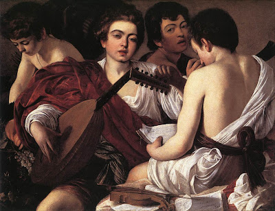
There are famous examples of the same issue. Carravaggio can be seen to flatten the spatial plane, but gets away with through his painterly flourishes and exceptional skill in depicting dramatic reality. Speaking of spatial discontinuity within his painting The Cardsharps, Eleanor Harper writes:

"Although three figures are rendered within this space, compositionally it is a painting with little cohesiveness and no perceptible depth. As we have seen before, the foremost model is utilized twice, appearing as both the cheat as well as the naive youth on the left hand side. The central figure glances down at his fellow player's cards, and yet his gaze is misdirected. Rather than improving his own chances, he stares unnaturally at the back of the naive youth. These two figures appear to be on the same spatial plane, with the central figure awkwardly and illogically to the left of the naive youth."


With regard to Salome with the Head of the Baptist, she writes

"As one examines specific works, spatial relationships, fragmentation, and a collage-like quality become increasingly apparent. While one may not notice such illusionistic qualities within individual figures often rendered very naturalistically, in fact the entire composition itself is overpowered by spatial discontinuity and a lack of cohesion. Figures appear layered, as though rendered upon the canvas successively rather than collectively, thus limiting the capacity for three dimensional space. Salome with the Head of the Baptist occupied Caravaggio's brush more than once. Great sensitivity was applied to the representation of Salome's facial features, yet she bears no physical relationship with her surroundings."


The same could easily be said of Carravaggio's The Musician


Want to test yourself against the Masters? John Baldessari once said, regarding the essential constitution of Art, simply that “you choose one thing over another. That’s the bottom line.” With that in mind, he chose Abraham Van Beyeren’s ‘banquet still life’ (1667) as the basis for a fun (and free) iPhone app. Play with the elements individually to create your own Dutch Still Life.

Wednesday, April 14, 2010

Jean Berain Grottesca


What? You uploaded 327 detailed photographs of the original etchings by Berain?! For free?

I had a religious experience. I was in the rare prints room of the NY Library yesterday, and was brought an original copy of the volume from 1711 containing all of Berain's etchings for the Sun King himself. Page after page of gorgeous detail and beautiful ornament. I couldn't believe my eyes! The guy just walked away and left me alone with this treasure!

Monkeys hanging by a string from a dude's butt, Goatboy and a snail in deep conversation; what's not to love? The guy was clearly a madman. It was a lot of fun just disappearing down the rabbit hole with him for a few hours. Take these two for example: The guy on the right of the panel is doing a little target practice with the naked guy on the left. Awesome! What the hell was he thinking?


There's a certain irony in celebrating work that could never have existed in a Democracy, while the very enjoyment of that work depends upon such wonderful democratic institutions as the New York Public Library. Free to all people through the generosity of donors such as Andrew Carnegie. A man who sold up his steel empire and donated the equivalent of $350 million towards the setting up of the Public Library system. That and our taxes, of course!

Anyway, there are way too many images to post on this blog, so I put them all here

Think I'm going back there with a better camera to take more pictures? 

"Taxi!"

Monday, April 12, 2010

Ornamental Panel


This is follow-on post from the earlier 'Grisaille, a closer look'. Above are two versions I created of a new panel design using a blend of traditional hand-painted techniques and digital technology.

I wanted to show you the possibilities that Photoshop affords. It's the same vase as before, this time combined with a whole stack of new elements that I either hand-painted and scanned, or painted right in Photoshop using the Wacom tablet.

The landscape image in the background is a small section of hand-painted mural that I created for a European client. Here is a photo I found online of a Swedish garden that I used as a reference for the scenic element of my panel.


Before shipping the mural on canvas across the sea, I sent each canvas section (approx 7' x 16') out to a large format scanner and had DVDs made of my mural. Now that I have everything digitized, I am free to re-configure and re-color. I can literally create countless new versions.

Everything is adjustable. From the colors and scumbled over-glazes to the elements themselves, all saved on separate layers. Here's a reference image that I liked from a book on Swedish Neo-Classicism. I used it as a starting point to paint the bottom element for my new panel.


And this is an image showing the original landscape mural, installed in Europe.

You can view additional images of the same mural installation here, on our website.

 The section I used for my new panel above is actually hidden behind the star-shaped mirror and side table.

Sunday, April 11, 2010

How to draw the Acanthus, Part I


This is an introduction to the subject of how to draw the Acanthus. The study of Nature has informed Design in ways more profound than mere surface ornament. This is one simple example of decoration that serves as an introduction to the topic. Generally speaking, the acanthus appears in two forms: the acanthus leaf and the acanthus scroll.

Here's what Meyer has to say about the Acanthus Leaf:
"Of all the ornamental designs which have been borrowed from plants the acanthus is the most popular and conventional. Since its introduction into Greek style it recurs again and again in every Western style. A symbolical significance has never been attached to the acanthus; its frequent and varied application is due to the ornamental development and beautiful serration of its leaves."
In 'Plant Symbolism', Gus Tassara disagrees and says of the symbolism of Acanthus:
"In Greece 2 BC the acanthus was a clear reference to life emerging from a grave. It was not initially a reference to resurrection in Christian sense, but in a sense that life is cyclical."
 Whatever the significance, we know that ever since, it has been showing up in some form or another and as such, is an essential part of the vocabulary of any decorative artist. Yet it's amazing how often we see it done poorly. Here's a great example that illustrates what I'm talking about. It's from the book "Constantino Brumidi, Artist of the Capital".


While neither example of acanthus is especially good (the one on the left, although much better, is bristling with spines and appears to be growing), it's easy to see that the artist responsible for 'restoring' the image on the right did so with heavy-handed over-painting, and clearly did not know what he was doing.

These illustrations should help develop the proper technique for creating the Acanthus and Acanthus Scroll. By the way; once you're done on this page, don't forget to check out Part II and Part III for tons more reference material and ideas. Part IV is a detailed geometric analysis showing you how to draw a volute, or scroll, of the acanthus according to ancient Roman principles.

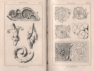
Let's start by taking a look at illustrations from Meyer's book of the acanthus naturalistically treated (in Plate 21 below, illus. 1-4). Following that are various schematic illustrations (Plates 21, 22 & 23) from antiquity to modern times.


The second generic form that the acanthus takes is the acanthus scroll. Of the acanthus scroll, Meyer tells us that it is "a purely artistic invention," pointing out that "the natural acanthus has no tendrils."Despite the artifice, it's as popular in decoration as the acanthus leaf itself.

"Flowers and calices, such as frequently occur in acanthus ornamentation, are usually developed on the lines of the acanthus leaf, however freely they may be composed in other respects and however little they may recall natural models. The acanthus scroll is not seldom supplemented by and organically combined with forms from other genera of plants, for example: laurel, oak leaves, ivy, ears of wheat, &c. What was said above of the acanthus leaf holds good here too for the differences of execution in the various styles. The greatest luxuriance and the highest elegance were attained by the Italian Renaissance. It is characteristic of the Louis XVI epoch that the spiral lines which form the basis of the scroll have been elongated and, so to speak, eliptically displaced."

These illustrations by the engraver Jean le Pautre, demonstrate the riotous profusion that the acanthus can attain. The guy was clearly a madman, and yes that's why we love him.


This final set of images are from a fantastic book titled "Guide for drawing the acanthus, and every description of ornamental foliage," by James Page, and should serve as templates for study of the construction of the acanthus. I posted a set of a lot more images from this book here.

I also posted an article about 18th Century French marquetry drawings, which have numerous acanthus leaf and scroll illustrations in great detail, that I also recommend taking a look at.