Wednesday, May 26, 2010

Treillage


Well, I was going to start this post by asking who hasn't painted a trellis? But then I realized that I hadn't painted a trellis.

I know they've been done a bazillion ways, but somehow I'd never done one before this project (pictured above) came along. There are examples of painted trellis dating as far back as Pompeii. I love how loosely the trees were painted here.


I also looked at Renzo Mongiardino for reference material, among others. His work is amazing. Here's his watercolor design for a trellis room. I highly recommend getting your hands on a copy of his book, though it's gotten quite pricey.


Figuring out those measurements in the semi-circular niche looks like a headache!


 Of course, there's the excellent trellis-work in the murals at Schloss Schonbrunn too:


These next few hardly qualify as 'trellis', but I loved them so much I wanted to show you.


Then I looked through my books at hundreds of Historic ironwork references to find a nice central motif for the curved coves. Here are a couple of great reference images I looked at. I also posted a huge set of reference material here. You may find them useful!

Finally, I settled on this one...
I thought that the frame might look nice without all the central elements. I knew the designer would think it too fussy with the additional detail (and I didn't feel like painting it), so I removed the detail.

Next, I then created this image in Photoshop to suggest an idea for the curved cove of the ceiling.


The designer went for it.

At this point it occurred to me that I should do the whole job in Photoshop, print it on canvas and just paste it up on the ceiling. In retrospect, if I'd made a good paper template I probably could have. I made an important judgment call; I felt that my trips to the chiropractor were worth it for the extra exposure I gained by working on-site as opposed to hidden away in my artist's garret. And so I decided to paint this ceiling on site. Doing so much painting over my head, I realized the importance of being comfortable while you work: it's just a simple fact that you can't do your best work if you're in pain.

Here's how I laid out my design on the ceiling. First, paint the ceiling with the color of your trellis. In most cases, beige or green. Then glaze roughly over the surface (as your Step Two), with a lighter shade. Don't finesse or worry too much about this layer, as you won't see too much of it in the end. Make it quick (think 'money').


Now lay down your trellis pattern in blue tape.


Once you've gotten your trellis design laid in in tape, paint the entire surface with your base sky color.


If you want to do a simple or clouded sky, now's your time. In my case, I wanted a blank sky with trees peeking through the trellis. I didn't care about clouds in this case; it was more about the trellis than the sky. Before peeling off my blue tape lattice, I scumbled in some background foliage, then added some rough edges to give a sense of dimension to the leaves. 

Here's the sequence spelled out a little more clearly: First, paint the entire wall surface with your trellis base color.

Now add a scumbled glaze layer on top.


 Now add your trellis design in blue tape.
Then paint the entire surface with your sky color, right on top of the blue tape. At this point you could just add a scumbled light layer on top of your base sky tone, like this...


If you wanted to end it here, you could just peel off your blue tape, which would give you a look like this;


Instead, I wanted a trellis that showed foliage behind, so I started painting leaves and plants before I pulled my blue tape;


Once you're satisfied with the background, pull your tape. You're now ready to start painting your shadows and highlights on the trellis itself.


I like to paint a drop shadow, though I know it's not strictly accurate in this case because there wouldn't really be a shadow thrown onto the foliage like that. Still, I feel that it gives my trellis extra dimension.

As a finishing touch, you could paint some leaves or blades of grass coming through the lattice work. This will bring your background forward, and make it feel a little more integrated. A unifying over-glaze on the entire surface at this point will also help to soften the overall look of your mural.

And there you have it!


Friday, May 14, 2010

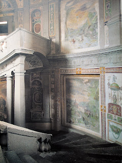
Palazzo Farnese


I always wanted my own map room. Frescoes all over the walls, and a floor that slides open to reveal a secret 3D James Bond diorama of all the nuclear installations in the world, with blinking red lights. I would also like guys in black suits to run alongside my motorcade, and believe that the only way to enter a cocktail party is to rappel through the window in an orange jumpsuit, but now I'm off topic.

The Palazzo Farnese; what's not to love?


The contributions of Antonio da Sangallo the Younger, Jacopo Barozzi da Vignola, Giacomo della Porta and in particular, Michelangelo, tend to take center stage when speaking of this wonderful Palace. No less spectacular though is the grottesque ornamentation (pictured above). this absolutely stellar work received the spotlight in an issue of FMR magazine. For those who would like to dig deeper, I posted a set of large images of grottesca from the Palazzo Farnese here.


By the way, If Italianate painted ornamental ceilings are your thing, take a look at these amazing 3-D panoramic tours of the Quirinal Palace (Palazzo del Quirinale), the Italian Presidential home. Scroll down the page and click on any one of the thumbnails for a breathtaking trip to Italy.

 You may also like to view this post on my blog about Italian painted interiors, with large images.

Monday, May 10, 2010

The World of Ornament


This is from the Taschen website regarding their book, The World of Ornament:
"Imagine having an opulent compilation of history's most elegant and beautiful patterns and designs at your fingertips - to use, peruse, admire, and be inspired by. World of Ornament brings together the two greatest encyclopedic collections of ornament from the 19th century chromo-lithographic tradition: Auguste Racinet's L'Ornement polychrome Volumes I and II (1875/1888) and M. Dupont-Auberville's L'Ornement des tissus (1877). Adapted from historical items dating back to antiquity, such as jewelry, tiles, stained glass, illuminated manuscripts, textiles, and ceramics, these ornamental designs encompass a wide range of cultural aesthetics including classic Egyptian, Greek, Roman, and Etruscan motifs, Asian and middle-Eastern patterns, as well as European designs from medieval times through the 19th century."

Okay, now imagine having that entire collection available online, completely free. Don't believe me? Check out this link. Use the top menu bar on the webpage to search through the different chapters. Pick one you like, then scroll over the large thumbnail on the left to see which filename to download. Right-click and save!

What an incredible resource the internet is!

Friday, May 7, 2010

Edward Lear


"I long to return to Sorrento,
To the lonely sea and sky.
I left my vest and socks there,
I wonder if they're dry."
Spike Milligan

Edward Lear (1818-1888) will forever be known mainly as the nonsense poet. I came across his poetry years ago through Spike Milligan, another mad genius. Lear traveled widely, eventually settling in San Remo, Italy in 1871.

He is less known as an artist, and yet he published many travel writings and illustrated many books. These images are from a beautiful set of lithographs by him, drawn on stone from life. I find these really charming.

Combine this reference material with the Schloss Schonbrunn murals or an Orientalist scene, and you have the makings of a classic mural.

Thursday, May 6, 2010

Murals: Helping the Aristocracy get lucky for Centuries.


Chimpanzees have been known to use a leaf to attract a mate. A dried leaf to be exact, because it makes a nice crunchy sound when you crinkle it. The male will sit with his legs spread, and crunch leaves until someone takes notice, puts two and two together and decides that yes, he's the guy they want to get with.

Bowerbirds will dress up their homes with everything from mushrooms to poop in an attempt to seduce a partner.


Insects, next in line for World domination, give their abodes the Royal treatment in the work of Artists like Jennifer Angus and Jan Fabre, who re-decorated Belgium’s 19th century royal palace. It took four months and 29 assistants to glue 1.6 million iridescent green beetle carapaces to the ceiling of the Hall of Mirrors.


It seems that using tools as a sexual strategy is not limited to humans, but we seem to use a variety unseen in any other species. A woman (or man) in a pretty red dress, a flashy car blasting music at 120 decibels, or the walls of our homes decorated with books (why else do we keep books we'll never re-read?) or fancy artwork.

The effectiveness of each depends only upon which market you're in.

European nobility used decoration in their own seductive way. High-walled residences were often placed at the front of the property, with the large gardens at the rear, visible only to the chosen few (as opposed to American homes that tend to sit in the center of their land, without walls, and display their treasures conspicuously as you enter the home - a less subtle, but obviously effective strategy). The public spaces of stately European homes were often the least ornamented. As you were lured further into the private sanctuary, you'd find the rooms increasingly lavish until you finally arrived at the perfumed jewel box of the boudoir.

This method backfired a bit on the Hapsburgs, who practically inbred themselves into extinction. Inbreeding might actually explain some of their more bizarre priceless booty, but that's a story best explained by Darwin.

UglyHousePhotos gives us this marvel. I don't even want to know if this worked as an aid to procreation.


It's amazing how straight the line is between Homo Habilus tying a feather on his loincloth (what am I, an anthropologist?) to me painting a Chinoiserie mural for a wealthy client.

So here's to Decorative Art! Glad to be of service.

Sunday, May 2, 2010

Perspective Drawing


John Morra's still life paintings have an architectural quality. In Mertz No. 7, above, our horizon line is level with the table surface. A Bladerunner landscape for ants. You can easily see that the items on the table are subject to the same laws of perspective that define the optical perception of buildings. The effect is magnified by placing the standpoint very close to the picture plane, creating an intimate effect. It's a cityscape in microcosm.

Perspective is just as important when dealing with objects in a still life as when painting a landscape.


Morra is a master of empirical observation, so I was curious when I saw his Still Life with Vessels, Pestles and Red Masher, 2008, (above) and noticed that the perspective of the saucepan on the left seems out of play with the rest of the elements in the painting. Again we are level with the tabletop, and are looking up at the upper rims of the vessels, yet the saucepan seems oddly tipped towards us.

I received a commission to paint a still life of antique medical implements, and chose to treat the composition similarly. This painting was to be viewed across a room, so I pulled the viewpoint back from the picture plane and raised the horizon line.

Unfortunately, the Ostrich and Kiwi eggs and the pile of books were the only items that weren't taken from a photographic internet reference, and the result is kind of lifeless and unnatural. It finally occurred to me that it's necessary to pay attention to the real world!


That's why it bothered me so much when I came across possibly the worst book ever on Perspective. Billing itself as a 'detailed training course,' it is peppered with snapshots of Italy and dares in the introduction to reference the treatises of Leon Battista Alberti and Filippo Brunelleschi, presumably to add a whiff of European old-world credibility. Do not buy this book. I'll use it as a jumping off point for a quick demonstration.

Here's an illustration from the book. They're trying to explain how to draw a 'flattened oval'. Presumably they mean an ellipse (a cone intersected by a plane), which is in effect a somewhat flattened circle. I overlaid a perfect red ellipse in Photoshop.


Here's how to show the perspective a little more clearly. First, I created a circle in red, overlaid on a grid.


Then I tilted the plane to simulate the effect of a circle lying on the ground directly in front of the viewer.


The book uses the following illustration in an attempt to show how a circle will optically flatten the closer it gets to the horizon line, until it eventually becomes a flat line. This is true, though their drawing is inaccurate and crude.


It then goes on to give an illustration of a bottle, and completely ignores this lesson. The bottle shown has two horizon lines; something I've never come across in nature. I drew the red lines to show the error: the bottom of the bottle has a vanishing point at VP 2, and the imaginary ellipse at the top vanishes at VP 1....Huh?


Okay, I went ahead and re-sketched their bottle a little more accurately to demonstrate what we've observed in Morra's work and what the author seems to have forgotten: that objects on a table-top adhere to the same rules of graphical perspective as the rest of the Universe, oddly enough.


At this point, we better take a look at what a Master had to say on the subject. This drawing pretty much ends all conversation on the matter. It's Uccello's drawing of a vase.


Not bad! [Uccello has positioned the viewer far from the vase]. You may also be interested in Uccello's drawing of a dodecahedron that I posted elsewhere on this blog.

Artist Adam Forfang is a painter of still lifes, among other things. Here's a detail from one of his paintings. I overlaid the red ellipses and grid to demonstrate that the horizon line is at the top of the bottle, and how the ellipses of the bottle seem to 'open up' the further they are from the horizon.


Pretty simple so far, right?

Let's look at a perspective of a polygon from the same book, and you'll see that it's evidently not so easy if so-called teachers can't get it right.

They start from this photograph. A difficult three-point perspective street-scape, and that's without taking the eight-sided polygon (octagon) of the fountain base into account. Tricky.


They then blunder into a sloppy attempt to render this graphically. 


It's so bad I don't even know where to begin. I guess I could tear out the pages and use them to clean up after my daughter's Guinea Pigs. First I drew an octagon on a grid. You can see that the opposite edges are parallel.

Then I tilted it down directly in front of the viewer. The horizon line is marked. You can see that each pair of parallel sides has a common vanishing point. Each VP converges naturally on the horizon line.


"Ah", you say, "but what if I'm not standing directly in front of the fountain, as in the photograph?"

This time, before we tilt the grid down, we rotate the polygon however much you want. In this case, I rotated it an eighth. Then I tilted it down. The parallel sides still have Vanishing Points that converge on the horizon line [sides 4 & 8 also have a VP that's way off to the right]. VP 1 represents our new vantage point, as we have taken a couple of steps to the left of the center of the fountain.


 Here's how Luciano Testoni drew an octagon and extruded it.


This is another photo from the book, used as reference for a different lesson.


The author goes on to say that this is basically one-point perspective, with the vanishing point off to the right somewhere. This is inaccurate. The recessed doorway and windows have their own (second) vanishing point, and the wide-angle lens used for this snapshot has created a third perspective wherein the vertical lines of the photograph converge somewhere off the top of the image. Let's ignore that effect due to distortion for now, but the second perspective of the door recesses is important to understand.

Muralists and trompe l'oeil painters will regularly have to work out just this kind of issue in their work.

Trying to find the vanishing point and horizon out to the right was complicated a little by the fact that the house is on a hill, so the ground and door saddle have a different vanishing point all their own.

Here is the second vanishing point that we are concerned with, out to the left.

Now let's draw our own version of the arched doorway. I straightened the vertical lines, as one would expect to see in a Mural, to give us a simpler two-point perspective rendering.
A close-up of the window shows the construction lines more clearly.
Okay so far, but the archway at the top of the door poses a small problem: How do we correctly draw the back of the arch in perspective?
Again, this is a very typical scenario, and has many applications. First, let's draw an ellipse (in blue) that conforms to the section of the arch that we can see. The red dotted line is the center line of the ellipse. A red dot marks the center of our ellipse.


The red line going back to VP 1, and passing across point (b), will intersect our dotted center line of the ellipse. From that intersection point, draw a line receding to VP 2 [line shown in green, below].


Now we have to create a copy of our front ellipse. This will become the back of our arch. The tricky part is trying to figure out where to place it, and how much it will shrink in scale as it recedes.

To do that, we draw another red line coming from VP 1, and passing though point (a). Where it intersects the top green line (at the X), drop a dotted line down to the bottom green line.

This will be the center of the back ellipse. Create a copy of the ellipse, and slide it back along the green line until it is centered over that point. With me?


Okay, now we need to scale down our ellipse. As you know, objects appear to shrink in size the further way from us they get. Our ellipse is too big.

Scale it down evenly through it's center point until it's edge touches point (a):


Done! Now simply remove all the excess lines, and you have a properly rendered doorway in perspective.