Sunday, March 18, 2012

Andrea Pozzo, Anamorphism and Illusionistic Ceiling Painting


At first glance it's hard to grasp what all the fuss is about. Puffy clouds and putti? Yawn. Looks like art by another dead guy. But it's an odd feeling the moment you realize you've been truly fooled. All those 3-D street-drawings forwarded by my aunt left me numb to the fact that anamorphism is hard to do well. There's something about watching reality on a computer that makes it seem a little, I don't know, unreal.

The painted ceiling at San Ignazio, by Andrea Pozzo, 1685

The truth is: there is not a single painter alive who is fit to sniff Andrea Pozzo's pants. There, I said it. The depth of his knowledge is breath-taking, to say nothing of his incredible talent as a painter. I'm not saying he was the greatest - I don't think he was - just that we're all rubbish by comparison. But the good news is that we can learn from him because he wrote a lot of it down.

Prying open his original volume of writings on architecture in perspective, bound in debossed pigskin, and peering at the arcane knowledge in Latin and German is like a looking-glass to another world. We're left, like peasants staring up at the ancient ruins of the Greeks, to suspect that aliens must have had a hand in this, because no mere human could possibly have conceived and created something of such greatness.

Figure 1

Andrea Pozzo painted his most famous work, the illusionistic trompe l'oeil ceiling of San Ignazio, in 1685. He waited 21 years until 1706, just three years before he died, to publish his methods for creating this dizzying trickery. His book was instantly, and hugely popular. There's no show-boating; he simply and clearly begins with the most basic linear perspective, and proceeds to step through the process with more and more complicated geometry.

But how did he counter the distortion to his artwork by the curvature of the vault at San Ignazio? If he just painted his flat design onto a curved ceiling, it would look hopelessly distorted and unconvincing from below.

Here's the simple version.

Pozzo prepared for his mural by first creating full architectural elevations

He then applied linear perspective to create the look of walls soaring above us.

We know that Pozzo was very partial to the Single Point Perspective theory. He wrote all about it. As far as painted representations of depth were concerned, he believed that Single Point Perspective gave a visceral 3-D experience that could not be beaten.

Linear Perspective in action [photo source]

To create his masterful illusion, he began by constructing - as an architect would - the elevations for the building, but in Pozzo's case he was imagining a building that would probably never be built. He meticulously designed the construction as if it actually existed in space, to the point where he could literally build it if he wanted to. In the case of the cupola of San Ignazio, he even offered to build the real thing. His illusion would add an additional three floors of height to the main ceiling.

Once he had his elevations drawn up, he applied the rules of linear perspective and came up with a drawing of how the building would look if viewed from directly below [Fig. 1]

Figure 2

Next he simply laid a grid over his entire drawing. He now had a map of how the ceiling would be painted if it were flat. The only problem was that the ceiling at San Ignazio is not flat, it's a hemispherical barrel vault. To counter the curvature, he had to use a little anamorphic projection. What he needed to do was to make his grid appear to be correct at a height that corresponds with the top of the actual wall, right below the curved vault. To do that, he imagined a grid (the red grid in Fig. 2) at the height of what would be a flat ceiling (if it existed).

I placed our viewer at a the center of the room [A], but we could decide to place him anywhere. As long as the position is known, the effect will work. Pozzo worked out his perspective illusion the same way, and marked the optimum viewing position with a brass plaque on the floor.


Figure 3

Anamorphism is a detailed subject, and I'm only skimming the surface here. The steps we are taking here will correct the distortion on the x axis, and create lines that appear straight even though they're painted on a curve. In the case of San Ignazio, I believe Pozzo only corrected for the x axis, not the y. 

For now, let's take a look at a cross-section of our room with the barrel vault [Fig. 3], which should of course be drawn to scale. Lines radiating from eye level travel through the red points on our grid and hit the curved vault. These are our new grid points. 


Figure 4
If Pozzo had also corrected the y axis it'd have looked something like Figure 4, but I don't believe he did. You can see that if we did that, our new grid points (green) on the y axis would start to creep down the end walls of the church. This would cause it's own problem not worth solving (or maybe I'm just feeling lazy). Instead, why not simply retain our original points on the y axis and let distance do the trick? Like this...

Figure 5
If we maintain the original grid on the y axis (as in Figure 5), and project our points through to the curved ceiling on the x axis, then when we stand in the middle of the room we'll get a convincing trompe l'oeil effect of a ceiling receding more-or-less correctly in space.

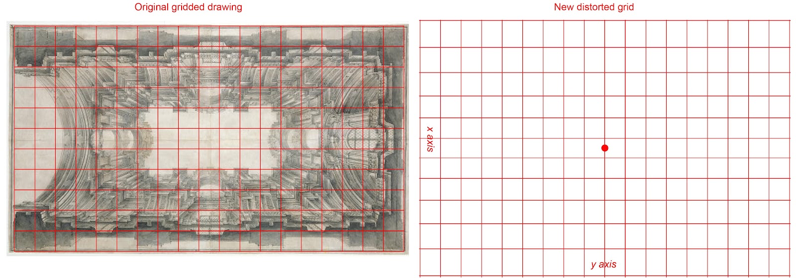
Our new grid would look something like Figure 6, with the red dot marking a position vertically above us. As the squares of the grid move further towards the top and bottom (the lower sides of the vault) they become stretched. The squares towards the enter of the grid (the apex of the vault) appear 'more square'.

Figure 6

In Fig. 6 you can see original dimensions along the y axis are preserved, but that we've distorted the grid along the x axis. All that's left to do now is to apply the visual information from our original gridded drawing to our new grid, square for square. Mark your ceiling with the new grid, and start painting.


Figure 7

I said that our solution is "more-or-less" correct because the reality is that a gigantic grid floating way above our heads is subject to distortion that makes it appear like the grid in Figure 7.

Here, Point A represents a point directly over our heads. You can see that the squares directly around the center are the least distorted. That's because they're on a plane that's perpendicular to our line of vision. As the grid recedes equally in all directions, it gets progressively more and more distorted by distance and a skewed picture plane.

This can be corrected for, and the good news is it's not that hard. If it was, we wouldn't have so many 3-D chalk drawings flooding our Inbox.

Figure 8: Altare di S Luigi Gonzaga, by Andrea Pozzo [source]

You can easily see what I mean in reality in Figure 8, where the camera's wide angle lens preserved the same optical distortion. Pozzo's ceiling appears to bubble down towards us in the center.

If we were to shrink and lower that big red grid along our sight line so that it floated closer over our heads, our artwork would appear to distort less. We could continue to shrink and bring that grid even closer to our eyes, and each time the skewed distortion would lessen. 3-D chalk artists position their grid so close that it's on the same plane as their 'eye' (the camera). If there is no distance at all between the eye and the grid, then the 'surface as surface' disappears completely, and the illusion is complete.

This is the secret to their creating those illusions in chalk of standing on the edge of a yawning crevasse or whatever.


Figure 9
This topic is really too big to go into fully in a blog post. You're going to have to wait for the workshop for that. I feel like I'm skipping around and not really explaining fully enough to be useful. Steps 1 through 6 above apply to the problem posed by Pozzo's ceiling in particular, and are not applicable to every situation of Anamorphism.

But to create a true anamorphic illusion, you have to imagine that you are floating inside the center of a very large transparent sphere. All around the inside of that sphere are equally spaced little dots that form a grid. We perceive the world through this grid. Using this idea, a perceptually truer projection correcting the curve of the vault is represented by Figure 9. See the difference between that and Figure 3?

Hmm, I see that I'm getting off topic and that this post is getting too long and I didn't even get to how he did the cupola yet. It's Sunday morning and I haven't even had my coffee yet.

By the way, you can download a full PDF of Andrea Pozzo's book (Latin and English version) "Rules and Examples of Perspective proper for Painters and Architects" here.


An early experiment in Anamorphism I did in exchange for membership at my local climbing gym

Wednesday, March 14, 2012

Adoration of the Lamb, by Jan Van Eyck

'Adoration of the Lamb', by Jan Van Eyck, is the lower central panel from his Ghent Altarpiece

Hailed as "the first evolved landscape in European painting" by Kenneth Clark, 'Adoration of the Lamb' by Jan Van Eyck is a masterpiece that reveals much about the spirit of the day in late medieval Europe. There was a distinctly sweaty-lipped drive to tame the wanton strumpet of Nature at every turn, and we can see it reflected here in the landscape behind the lamb.

There's nothing less Godly than an untidy wilderness
The Church at the top of the hill, overlooking its kingdom
"Looking at the Tuscan landscape with its terraces of vines and olives and the dark vertical accents of the cypresses, one has the impression of timeless order. There must have been a time when it was all forest and swamp - shapeless, formless; and to bring order out of chaos is a process of civilization".


Check out the detail in the embossed damask pattern
"Since Giorgione first mythologized Arcadia by showing us naked women in an idealized landscape, we have been captured by the comforting illusion that nature is a mirror of human perfection."

The "pastoral fallacy" had inspired Theocritus and Virgil (who seems to have made an appearance in this panel dressed in white), and might have it's roots even further back: Pre-Historic man is said to have been subject to a vision of paradise genetically encoded as "The Savannah Hypothesis". It's a fascinating theory that suggests that we respond to this kind of landscape because it most closely resembles our old hunting grounds as knuckle-dragging simians.

You could even make the argument that artificial landscapes from stately homes to our lowly city parks are designed according to this same theory: visible water sources, easily navigable pathways, open vistas and vantage points (for hunting) and reference markers (so we don't get lost) were all necessary for survival for hundreds of thousands of generations.

All photos this article, source: 'Closer To Van Eyck' Project


Detail from lower right panel

Friday, March 2, 2012

Raphael Loggia Ornament


What's the most fun you can have without a King-sized bed and a rubber chicken? Yep, you guessed it: I just spent a day studying an original set of hand-painted engravings from 1770 of Raphael's designs for the painted ornament for the loggia at the Vatican.

It took three of us just to carry the first volume onto the viewing table. This thing looked like the Queen Mary hoving into view. Raphael himself could have delivered it on a unicorn and I'd be no more impressed. It was the most awesome object I've ever seen.


Three volumes, (the first of which measured about 24" x 36"), meticulously engraved, and subsequently painted in vibrant gouache of Raphael's panel, ceiling and pilaster designs for the Vatican in a riotous mixture of earthy fauna, gauzy maidens, beardy gods and grotesque ornament of every imaginable type.


Can somebody please explain the Universe to me, because I'm a little confused: How is it that one of only three complete sets in the world of these spectacular engravings can sell in November of last year for only $25,000, when Damien Hirst can sell horse manure for a million? It makes me so mad. And why am I finding out four months too late? I would have gladly cashed in my daughter's college fund if I'd known.


"The loggia, or colonnaded porch, on the second story of the Apostolic Palace is one of the Vatican’s most remarkable art treasures; its decoration, designed by Raphael (1483—1520) and executed by his workshop in 1517- 1519, epitomizes the spirit of the Italian Renaissance in its synthesis of Christian and classical themes. The thirteen square vaults of Raphael’s loggia each contain four frescoes of scenes from the Bible, from the Creation to the Last Supper." [source


Noah's Ark scene from the Vatican loggia...
... and the same scene as depicted in the set of engravings
"These splendid, large-size copperplate engravings, from the suite Le Loggie di Rafaele nel Vaticano (Rome: 1772-77), after the celebrated frescoes by Raphael in the loggia of the Vatican, are scarce, with OCLC recording only two complete copies in libraries worldwide.

"The Raphael Loggia consists of thirteen arches forming a gallery sixty-five meters long and four meters wide. Its construction was begun by architect and painter Donato Bramante in 1512, under Pope Julius II and was completed by Raphael under the reign of Leo X. Raphael began work on the frescoes in 1517.


"The plates, designed by P. Camporesi, G. and L. Savorelli Teseo and engraved by G. Volpato (1733-1803) and G. Ottaviani (1735-1808), depict, in a vibrant color gouache, the pilasters, paneling, ceiling panels and two doorways with floral, figural and architectural motifs. Where human figures in the original frescoes were compromised by weathering and erosion, engravers Volpato and Ottaviani replaced them with elements from the Vatican tapestries designed by Raphael.


"While Raphael's Vatican frescos were admired in their time, they were ultimately overshadowed by the work of Michaelangelo until the Neoclassicists of the eighteenth and nineteenth centuries rediscovered the Renaissance, and Raphael earned his place as the era's greatest artist of them all.

""Raphael is categorically the greatest painter of the last millennium, and the Loggia is his most significant legacy," says Antonio Paolucci, director of the Vatican Museums and esteemed art historian.


"And yet the Loggia is the least known of Raphael's works. Millions of visitors to the Vatican Museums pass by it every year, but cannot go inside. Looking from Saint Peter's Square, it is in the second of the three glassed-in hallways across from the building in which the pope resides. When it was constructed, in the early part of the sixteenth century, it overlooked a garden. The thirteen arches of the Loggia frescoed by Raphael were not enclosed in glass until the nineteenth century. Originally, they were open to the luminous Roman sky, which made their colors even more brilliant" (Sandro Magister, Chiesa Espressonline)."

[source]

It has been notoriously difficult to find any images of Raphael's loggia work - the fact that the loggia are closed to the public and sealed behind glass has not helped - but Abbeville Press has published what looks like a fine book on the subject.