Monday, August 25, 2014

Exotic Recipes from Artists' Apothecaries


Run by the Quakers until it closed in 1933, the Stabler-Leadbetter Apothecary Museum is a step back in time.

Wherever I go, I collect samples of local earth. I scrape ancient statues into old film canisters with a pocketknife and keep them for my collection; the rainbow-colored sandstone of Petra is a particular favorite. I keep it in a box under my bed next to the bald eagle eggs. Relax, I'm joking. I ate those eggs ages ago. 

Swirls of color in sandstone, Petra, Jordan [Ed Trayes, photographer]
But pigment has always had a colorful history; explorers travelled to the four corners for centuries specifically to plunder color, until chemists in the 18th century wrested the practice from the hands of alchemists and their hired goons and took it indoors to the laboratory. But to this day, certain colors retain hints of their exotic past. Red ocher, for example, is a constant reminder of our stellar origins. Iron oxide is forged in the belly of dying stars that explode and scatter their contents across the galaxy. In fact, Mars still sends a kilo of it to us every day. (I wrote a whole post about it, here)

Companies like De Mairo Pigments still sell natural lapis lazuli pigment
Not content with simply smearing our canvases with dirt, we've forever ranged across the earth to uncover ever more exotic pigments. As with any modern luxury item, the rarest pigment conferred a whiff of superiority upon anyone rich enough to afford it. The expensive pigment cinnabar was conspicuously splashed all over the walls of Pompeii. We assume that they just liked the color red, or were colorblind, but in the same way that we line up to buy the latest designer excrescence, perhaps they simply had to have it because it was new and exotic. Ancient Egyptians wore lapis from Afghanistan and iron beads from Mars. Venice, by the late fifteenth century, had developed an offshoot of the apothecary specifically for artists, called vendecolori, which sold pigments like the exotic oltremare da venezia – lapis lazuli imported from the mines of Badakshan, and first described by none other than Marco Polo.(1) 

The deep saturation of "Pompeiian Red" is due to the addition of fine granules to the pigment.
Wax was applied to preserve and protect the finish.

Before this time, it was perfectly natural for artists to run down to their local Apothecary for the ingredients of their craft, but these were closer in spirit to shaman's huts than laboratories. Records of Apothecaries dating as far back as 1,500 BCE in ancient Egypt show over 800 recipes and 700 different drugs.(2) Not all of the ingredients were exotic in a "strange and alluring" way, some of them were just plain weird: By the time the Renaissance rolled around, these ingredients naturally expanded to include all sorts of herbs and ground minerals of every kind and color, soaps, cosmetics, gems such as amethyst and emeralds, oddities like “ground unicorn horn” (rhinoceros horn that came through Spain from Africa), tobacco (also through Spain in the fifteenth century), sulfur, mercury, the skin of roasted vipers, dried earthworms and human faeces (most prized being those of young children), bizarre elixirs and, of course, illegal poisons like arsenic and hemlock: Shakespeare’s Romeo picked up the poison he used to kill himself from an apothecary. 

Victorian Medicine Case [source]

Combine this with the practice (for certain illustrators of Islamic illuminated texts) of making the finest brushes from hairs gathered from the inside throats of kittens, and it's easy to see why artists were traditionally looked at sideways. As for me, I'll stick to ordering from the catalog.

Recommended reading:
"Color," Victoria Finlay, Random House
"Colors: The Story of Dyes and Pigments," Abrams Discoveries

(1) Vendecolori a Venezia: the reconstruction of a Profession,” ­Louisa C. Matthew, The Burlington Magazine, Vol. 144, No. 1196 (Nov., 2002), pp. 680-686
(2) A History of Pharmaceutical Compounding. Secundum Artem ,” Allen, Jr, Lloyd, Volume 11 Number 3.

Tuesday, August 12, 2014

Q: Why is the Sky Brighter over the Sea when it's Windy?

Breezing Up, Winslow Homer
A: Ask a sailor. 

There was a time when reading the weather meant more than just clicking an app on your smartphone. Seafaring Greeks, Vikings or Moors weren't concerned about choosing appropriate footwear for the long walk to the car, or remembering to pack a sweater to brave frigid air conditioners in corporate HQ; they needed to learn to read natural signs of approaching weather because their lives depended on it.


Becalmed mariners have long known when a stiff wind is approaching because the sky over the sea gets brighter in that direction. Why? It was a mystery for years until Galileo Galilei came along and applied his massive brain to the problem. The famed mathematician and astronomer was known to take long walks on the beach while contemplating the heavens, and while sitting on a hill overlooking the ocean one day, it suddenly occurred to him.


He had been pondering the question of the texture of the moon: Since the moon appeared so bright in the night sky, did that mean that its surface was mirror-like? Was it so smooth that it reflected the sun's rays directly towards the eyes of this earth-bound observer? Or was it rough and rocky?


His Eureka moment came while witnessing the effect of approaching wind on the water. As the wind picked up, it would roughen the surface of the water. If the sun was shining at the time, and the air being dense with moisture, the now fractured surface of the water would bounce the reflection of the light source (the sun) in all directions, where it would be scattered by the humid atmosphere and appear bright:

"From such waves, as from many mirrors spread over a wide area, there would originate a much brighter reflection of the sun than would exist if the sea were calm. Then that part of the vapor-laden air may be made brighter by this new light and by the diffusion of that reflection.  
This air, being high, sends also some reflection of light to the eyes of the sailors, while they, being low and far off would not be able to receive the primary reflection from that part of the sea which is already being ruffled by the wind twenty or thirty miles away. And that is how they perceive and predict a wind from afar."
Galileo's theory that rougher surfaces appear brighter than smooth surfaces led him to claim that the surface of the moon must be rocky and not glass-like; a theory that would be proven correct many centuries later when we finally stood on it. I say "we": I had nothing to do with it. 

He proposed a thought experiment to illustrate his point: Imagine that the sun is shining on a bright white-washed stone wall. Now, imagine hanging a mirror on that wall and stepping across the courtyard. Which looks brighter; the mirror or the wall? Spoiler alert: it's the wall.

Man in Armour, Rembrandt van Rijn

What's this got to do with painting? 

Medieval illuminators knew to think of gold-leafed areas of their panels as dark compositional elements, even though symbolically they represented the effulgent light of the Lord. It was obvious to them that while the applied gold surface may have been reflective, it was not shiny: it was physically dark under normal lighting conditions

Basically my point is this: paint shiny surfaces dark except for their specular highlights.

You should also look at this post regarding the technique for painting reflective surfaces like gold.

Sunday, April 13, 2014

The Ideal City


A staggeringly boring 'Ideal' cityscape by Fra Carnevale

The idea that an ‘ideal city’ is even possible is a tantalizing dream born of a desire to escape our current situation, wipe the slate clean and start afresh. It’s part of the reason colonizers get so glassy-eyed when it comes to setting up shop in a newly colonized space; the attempt to transcribe the perfect world that exists in our imagination into real bricks and mortar has excited both creativity and hubris for ages, from cave-painters to conquistadores. The downside - that you can’t just run away from human nature - hasn’t failed to excite its own brand of dystopian creativity too, where writers and artists have pointed out just what a disaster these utopian delusions invariably turn out to be. 

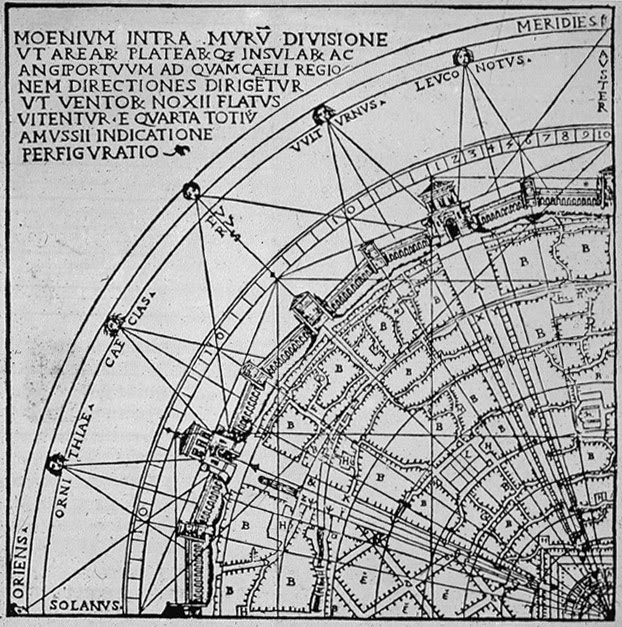
Vitruvius, Plan of an Ideal City

From hippy communes to Brasilia, the attempt to corral people into synchronous alignment is like trying to stop a spinning drill bit with your lips: You’re welcome to give it a shot, but it’ll end in tears. At the end of the day, we monkeys don’t like to share our banana. The synonymy between “idea” and “ideal” means that, by definition, a thought must stay in our heads if it’s to remain perfect, because as soon as it turns into action it is reduced and corrupted by the physical world. 

Renaissance ideal cities inspired by Vitruvius (15th-16th c.) 1. Filarete, 2. Fra Giocondo, 3. Girolamo Maggi, 4. Giorgio Vasari, 5. Antonio Lupicini, 6. Daniele Barbaro, 7.  Pietro Cattaneo, 8/9 di Giorgio Martini. [source]

Werner Herzog’s documentary, “Encounters at the End of the World,” has its share of misfits and oddballs all drawn like lemmings to the polar research station at McMurdo Sound in Antarctica, in some ill-conceived attempt to “get away,” only to end up living in closer proximity with other oddballs than they ever would have if they’d just stayed back home. What sustains and enables them to stay cooped up inside for months on end is simply the idea of all that space around them, far away from the big bad world, demonstrating the power of a good concept to overwrite empirical reality. 

From Hugh Ferris’s “The Metropolis of Tomorrow” (1929)

Plato would argue that Ideal Forms are not just in our heads, that they have a very real existence outside of space and time, and that they are the models from which our world is built. They prevent us from sinking into depravity and weekend marathons of Duck Dynasty by reminding us that we are better than that; that as we careen through life we should be more honest, more courageous, more compassionate. 


Sunday, March 2, 2014

Which one is the Golden Rectangle?


Imagine that you are floating inside the center of a very large transparent sphere, like Leonardo’s Vitruvian man above. The yellow area is our normal 60º field of undistorted view. Outside of that yellow field, things start getting weird. Our binocular vision receives two sets of images (our overlapping yellow circles in the illustration above), and sends them back to the brain for processing via the curved camera lenses of our eyes. Through comparison between these two images and a little high-speed triangulation our brains tell us how far away things are. Harry Moss Traquair described our visual field in 1927 as, "an island of vision surrounded by a sea of blindness." 

Numerous studies by “Golden Sectionists” trying to prove Man’s natural attraction towards the Golden Rectangle have found that people are just as likely to choose any horizontal rectangle that roughly conforms to the one that circumscribes the yellow shape, above [Or roughly 1:1.5, and not the Golden Ratio of 1:1.618]. 

Which one is the Golden Recatngle?

Our natural affinity for this shape is possibly its relation to our undistorted field of vision and not, after all, anything to do with nautilus shells. See if you can pick out the Golden Rectangle from the group of quadrilaterals, above. 

[I'll put the answer in the comments, below] 


Monday, February 3, 2014

Landscape Painting Lessons from Constable, Gainsborough and Corot

Landscape with Hagar and the Angel, John Constable 

There's an anecdote about Constable that shows, apocryphally or not, how revolutionary he was for his time regarding the use of color: "The story goes that [Constable's friend and patron, Sir George Beaumont] remonstrated with him for not giving his foreground the requisite mellow brown of an old violin, and that Constable thereupon took a violin and put it before him on the grass to show the friend the difference between the fresh green as we see it and the warm tones demanded by convention." [Incidentally, Landscape with Hagar and the Angel (above) was Beaumont's favorite painting].


The Embarkation of the Queen of Sheba, Claude Lorrain

Of course, Constable wasn't the first to notice that grass is green and violins brown. Both of them knew that such matching was against the strict requirements of contemporary taste, however, and possibly even aesthetics. The point at issue was a much more subtle one - how to reconcile what we call "local color" with the range of tonal gradations which the landscape painter needs to suggest depth. We find an echo of these discussions in an observation by Benjamin West recorded in The Farington Diary

"He thinks Claude [Lorrain] began his pictures by laying in simple gradations of flat colours from the Horizon to the top of the sky, and from the Horizon to the foreground, without putting clouds into the sky or specific forms into the landscape till He had fully settled those gradations. When He had satisfied himself in this respect. He painted in his forms, by that means securing a due gradation, from the Horizontal line-to the top of his sky, and from the Horizontal line to the foreground. Smirke remarked how entirely all positive colour was avoided, even to the draperies of the figures. Turner said He was both pleased and unhappy while He viewed it, it seemed to be beyond the power of imitation." 
Flatford Mill, John Constable

These experiments with gradations from a pale blue to a mellow brown by seventeenth- and eighteenth-century artists taught Sir George Beaumont (an amateur painter himself) how to suggest light and distance in a landscape. The eighteenth century had even invented a mechanical device to aid the painter in this transposition of local color into a narrower range of tones. It consisted of a curved mirror with a toned surface that was appropriately often called the "Claude glass" and was supposed to do what the black-and-white photograph does for us, to reduce the variety of the visual world to tonal gradations. Eighteenth-century masters achieved most pleasing effects with foregrounds of warm brown and fading distances of cool, silvery blues.


Lady Elizabeth Delme and Her Children, Sir Joshua Reynolds

Looking at Reynolds' Lady Elizabeth Delme and Her Children in the National Gallery in Washington or, for that matter, at Thomas Gainsborough's Landscape with a Bridge, we realize the value of an even gradation based on the brown of the foreground. Indeed, a glance at Constable's View of Salisbury Cathedral convinces us that he, too, achieved the impression of light and depth by modulating tone.

View of Salisbury Cathedral, John Constable

Constable questioned the need to remain within the compass of one scale. He wanted to try out the effect of respecting the local color of grass somewhat more-and, indeed, in his Wivenhoe Park he is seen pushing the range more in the direction of bright greens. Looking at Wivenhoe Park now, it looks so natural and obvious that it's easy to forget its daring originality.

Wivenhoe Park, John Constable

Once we realize this basic fact, the master's contention that all paintings should be viewed as experiments in natural science loses much of its puzzling character. He is trying to produce what he called the "evanescent effects of nature's chiaroscuro" on canvas, within a medium which excludes matching. Indeed his experiments resulted in discoveries. For instance, there was resistance at first against so much green, which was thought to upset the needed tonal gradation. 

There is a story about Constable's sitting on the jury of the Royal Academy, of which he was a member, when by mistake one of his own paintings was put on the eascl for judgment, and one of his colleagues said rashly, "Take that nasty green thing away." 

Landscape with a BridgeThomas Gainsborough


A quick walk walk through any major gallery shows that in the end Constable's method found wide acceptance. We know that when his Hay Wain was shown in Paris, French artists were stimulated to repeat his experiments and lightened their palettes. We can now read much brighter pictures, such as the landscapes by Corot and, what is more, enjoy the suggestion of light without missing the tonal contrasts which were thought indispensable. We have learned a new notation and expanded the range of our awareness.

Ville d'Avray, Corot

[The previous passage was excerpted from Ernst Gombrich's Art and Illusion]