Concept artist and Matte painter Whit Brachna is an incredible draughtsman and artist, who is equally adept at traditional and digital media. His pencil sketches have a confident line and a solid understanding of value.
That's why I made the plunge and purchased his full length Photoshop painting tutorial (available for purchase here). He also generously includes a set of Photoshop brushes he developed. This short video clip gives you a sample of his technique and style:
I love watching the slow transition from nebulous pixels into something tangible and 'real'. I especially like his use of Google Sketchup as an initial 3D thumbnail step when dealing with interiors and built environments. He quickly renders his design in Sketchup, a super simple 3D drawing program, in order to rapidly work out perspective issues, and then uses them as background templates upon which to layer his painting.
I'm all for taking advantage of automated processes to speed the painting along, and this was an approach I hadn't seen before checking out some of his other drawing tutorials.
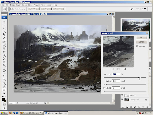
In the full video, Brachna runs through of the process he used to develop this landscape (below), while dealing with some of the foundations of creating a painting including the use of value, shape, texture, color and other design principles. Although in this case he's dealing with a Photoshop painting, his principles are sound and can be applied to any medium.
Preferring to start work from a darker canvas [Brachna feels that starting from white tends to push us towards lighter values overall] he quickly lays in blocks of color with the digital equivalent of a house-painting brush.
It's super easy to create your own Photoshop brushes, and they can be a vast improvement on the standard presets available. Brachna's approach to developing brushes is to actually create the brush tip by painting it, as opposed to what I've done where I create a mark with a traditional brush and ink set-up, then scan it in and use that.
 |
You can tell that he's really sensitive to subtle hues present in nature, where 'grey' doesn't really exist, and establishes blocks of color early-on in order to ensure that his finished work doesn't appear flat and dead. Though he works very roughly at first, there is also an awareness of the interplay between hard and soft edges in a landscapes and how they create depth.
I've posted before about how painters such as Carravaggio are masters of suggestion. They reserve tight detail for a relatively small area of the canvas, preferring to let the rest of the canvas sit like a painterly puff of smoke. You know something's there without having to see it delineated expressly. Especially in areas of dark value, there is no more than a suggestion of form. This reliance on suggestion is what separates painting from photography.
Nevertheless, it can be easy to think of shadows as an after-thought; to save your concentration for the highlight and/or focal point. Close study of great painting reveals that although shadows can be vague with regard to detail, they are not vague regarding form (or color for that matter). Objects in low light appear distilled to an essence of form, but are still very clearly there. Don't neglect those shadows!
I have mentioned before on this blog not to pick up the small brush until you're done with the big one. Usually, even when you think you're done with the big brush, you're not. Brachna echoes something of this sentiment when he evidently resists the urge to zoom in to his painting until absolutely necessary, knowing that the temptation would be too great to resist fussing around with tiny brushes, and then losing the big picture.
Anyway; I gotta go!
Check out his work.


Very interesting post Allan . I have have started playing around with digital painting and I think it is a great practice , it opens up your creativity . Thank you for this post.
ReplyDelete.............brain overload..........hmmmmmmm...this will take some time to absorb!
ReplyDeleteI have wathed the tutorial...really good. Do you know if he uses a tablet ( Cintiq?)
ReplyDeletePascal,
ReplyDeleteI haven't found any reference to the specific tablet he uses, but I know that the Wacom Intuos tablet is pretty much the industry standard, as is the one I use.
I came across an interesting review of Wacom Intuos v. Cintiq here...
http://www.tomrichmond.com/blog/2007/01/08/using-a-cintiq-instread-of-a-tablet/
Quite an eye opener, really inspires me to look at brushes again.
ReplyDelete