

Wouldn't we all like to be able to paint like this guy?
Gerard De Lairesse's trompe l'oeil grisaille masterpiece is an excellent lesson in how to paint trompe l'oeil. Taking a closer look at Allegory of the Sciences, we can discern his technique for creating a successful illusion of depth - particularly with reference to the value range he employed.
When I speak of 'value' here, I'm referring to the Munsell color system. I personally use the term interchangeably with 'tone' or 'tonal value', although that's probably not correct.
I will never forget speaking with my friend Dermot Power (concept artist for films such as Star Wars, Harry Potter, Batman Begins, Charlie and the Chocolate Factory and Alice In Wonderland), who told me that you have to be really careful with highlights: The sign of a novice is the tendency to touch everything with a dot of white on the highest point. "It looks like it's snowing" he would say. That really stuck with me.

Examining De Lairesse's painting, we can see that he reserved his brightest highlights and darkest lowlights for a section of the painting occupying no more than 30% of the overall composition, inside the lower right section above. I'm calling this his 'High Contrast' section.

The rest of the canvas is roughly broken in half by two areas of 'Medium Contrast' and Low Contrast'. It is important to recognize the sense of balance achieved by this: the painting neither jumps out at us, nor recedes too much. In my opinion, a general rule of thumb would be to divide the 'value sections' of your canvas into percentage divisions of 30/40/40, as above. If every area within the painting was given the same value range the trompe l'oeil effect would be flattened and unconvincing.
 |
| 'High Contrast' sample, with tonal range |
 |
| 'Medium Contrast' sample, with tonal range |
 |
| 'Low Contrast' sample, with tonal range |
Let's examine this further: Sampling from the High, Medium and Low Contrast areas above and isolating the value of the tonal ranges, we see that the ranges are represented within the graph below.

When plotted against the fullest possible value range (solid black through white), we notice some interesting things. To begin with; even the area that contains the darkest lowlights and lightest highlights (lower right section of the painting with the seated figure), doesn't come close to representing the full range of tones available. In other words, the outside boundaries of the value range De Lairesse employs represents no more than 75% grey at its darkest, and 25% grey at its lightest.
Of course, this is borne out through our own observations of nature: Shadows are never 100% black, nor are highlights 100% white. That last point is worth restating, because I have seen it done incorrectly many times: Highlights in trompe l'oeil painting are never 100% white. What? Oh alright, not "never", but let's just say they should be used extremely sparingly. Unless you're rendering a high gloss sheen on a white marble statue, pure white highlights should be a last resort.
The value of pure white (Value 10 according to Munsell) and the value of pure black (value 0) are actually unattainable with pigment, being theoretical limits.
The following illustration of spheres receding in space uses the same value range De Lairesse employs to differentiate between foreground and background objects. You can plainly see that the optical laws of chiaroscuro apply: If you want an object to appear to recede in space, limit the values to the middle of the spectrum.
 |
| Note that the whitest highlight in the foreground sphere is still not pure white |
The point gets a little confused here due to the fact that we are dealing with a grisaille representation of carved statuary, not simply a painting of objects in space, as say, a trompe l'oeil landscape. Our objective is to convey a sense of how an object is carved in stone. So not only do we flatten the value range to represent how an object recedes from us, we also flatten the it when representing objects in low relief, as in the detail of the frieze, below.

I posted these before, but they are such perfect examples of trompe l'oeil low-relief cameos that I am adding them here again. They are by the artist Christen Kobke, and demonstrate precisely the technique of expanding the value range to imply high relief, and reducing the value range to imply low relief. And yes; these are paintings!
 |
 |
| Note the reduced range of tonal values in the low relief of the wing |
Generally speaking though (when painting trompe l'oeil molding for example), there is a simple rule of thumb that we should adhere to when dealing with middle distance objects, of medium relief: That is the rule of thirds. Roughly speaking, a sphere should be divided into thirds between highlight, mid-tone and shadow, as below.
 Not only that, but an accent tone, light or dark, should be one third the width of the half-tone, as below:
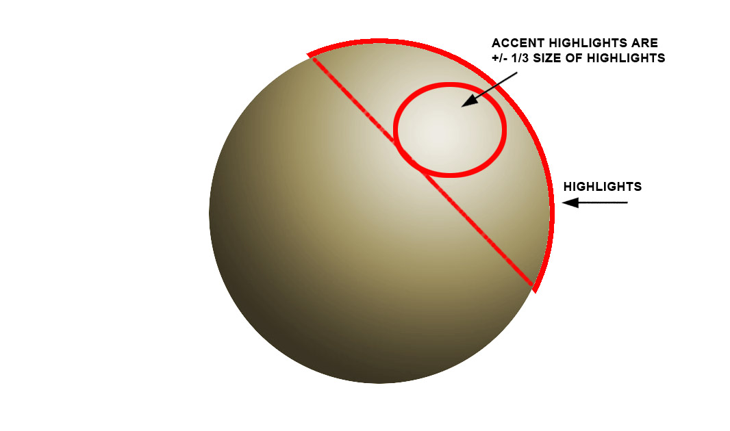


darn it ....I just wrote a mini essay in here and it lost it. grrrr! Fantastic article Alan. I want to get into it about how contrast usually guides the viewer to the point of interest but that here it is used to show relief and in turn that makes me think of how you can use contrast to distract a viewer from the point of interest i.e show a part of the painting first then the main point of interest second ....like a character hiding in the shadows being revealed after the pursuer - cripes..it's a longer conversation we'll have to get in to later
ReplyDeleteExcellent point Dermot! The visceral impact of high contrast draws us immediately to it, but the painting often reveals greater interest in the quieter passages. Using tonal contrast effectively can create a painting you'll want to take a second look at, as opposed to one-hit splashy bling.
ReplyDeleteVery interesting Alan I will have to work on some of this genre, beautiful examples!
ReplyDeleteOh and be sure to come and join my Amazing Giveaway from Splenderosa!
xoxo
Karena
Art by Karena
This is the best article on decorative painting I have read online. Bar none. Thanks for putting up real info and analysis.
ReplyDeleteThanks for taking the time to compile, write and share such great information.
ReplyDeleteBeautifully clear explanation, thank you!
ReplyDeletemagnifico, it's about time to go on blog and not find commercials only...I'm just tired of that stuff, this blog is for :reservation required..really beautifull
ReplyDeletethanks for being like this!
Susanna
Thanks Dermot, for sharing so much wonderful information...Serendipity brought me here! And I'm glad I found you! I particularly enjoyed the "grisaille" and ornamentation section of your blog. So much work to post all of this! I appreciate your efforts, and wish you and your family the best.
ReplyDeleteAngela
Hey Alan
ReplyDeletewonderful, thought provoking posts as always...
I love referring back to them whenever I need a nudge in the right direction, or some good information.
Thanks
Kristin
Thanks for this very fine analysis. I had a teacher (a long time ago) who made me paint every picture as a grisaille before allowing me to move to colour. Tonality is the boss in (this kind of) painting.
ReplyDeleteMichael.
............lovely - "Fake" art of illusion for limited spaces.............
ReplyDeleteExcellent....I have searched every book I could find on trompe l'oeil (very few)and nothing has been as informative as this. You are a marvelous teacher - so clear and concise. Thank you so much. You have no idea how pleased I am to have found this.
ReplyDeleteAnexquisite scientific breakdown of the technique. Merci beaucoup. Evidentemente, las personas que dividan los colores asi son geniales. Me hacer recordar que si, que la industrializacion tenia sus beneficios. Las bellas artes son tamben divinas.
ReplyDeleteExtremely clear and informative, it is a joy to find this page after searching through lots of very patchy stuff elsewhere on the internet. Thanks so much!
ReplyDeleteGreat article! I have been planning to paint the ocean on my wall and wanted it to be as realistic as I could. Your tips were easy to understand and remember.
ReplyDeletegood read. thanks mate
ReplyDelete2021 and still finding this work interesting. thank you for postitng
ReplyDeleteमहाकालसंहिता कामकलाकाली खण्ड पटल १५ - कामकलाकाल्याः प्राणायुताक्षरी मन्त्रः
ReplyDeleteओं ऐं ह्रीं श्रीं ह्रीं क्लीं हूं छूीं स्त्रीं फ्रें क्रों क्षौं आं स्फों स्वाहा कामकलाकालि, ह्रीं क्रीं ह्रीं ह्रीं ह्रीं हूं हूं ह्रीं ह्रीं ह्रीं क्रीं क्रीं क्रीं ठः ठः दक्षिणकालिके, ऐं क्रीं ह्रीं हूं स्त्री फ्रे स्त्रीं ख भद्रकालि हूं हूं फट् फट् नमः स्वाहा भद्रकालि ओं ह्रीं ह्रीं हूं हूं भगवति श्मशानकालि नरकङ्कालमालाधारिणि ह्रीं क्रीं कुणपभोजिनि फ्रें फ्रें स्वाहा श्मशानकालि क्रीं हूं ह्रीं स्त्रीं श्रीं क्लीं फट् स्वाहा कालकालि, ओं फ्रें सिद्धिकरालि ह्रीं ह्रीं हूं स्त्रीं फ्रें नमः स्वाहा गुह्यकालि, ओं ओं हूं ह्रीं फ्रें छ्रीं स्त्रीं श्रीं क्रों नमो धनकाल्यै विकरालरूपिणि धनं देहि देहि दापय दापय क्षं क्षां क्षिं क्षीं क्षं क्षं क्षं क्षं क्ष्लं क्ष क्ष क्ष क्ष क्षः क्रों क्रोः आं ह्रीं ह्रीं हूं हूं नमो नमः फट् स्वाहा धनकालिके, ओं ऐं क्लीं ह्रीं हूं सिद्धिकाल्यै नमः सिद्धिकालि, ह्रीं चण्डाट्टहासनि जगद्ग्रसनकारिणि नरमुण्डमालिनि चण्डकालिके क्लीं श्रीं हूं फ्रें स्त्रीं छ्रीं फट् फट् स्वाहा चण्डकालिके नमः कमलवासिन्यै स्वाहालक्ष्मि ओं श्रीं ह्रीं श्रीं कमले कमलालये प्रसीद प्रसीद श्रीं ह्रीं श्री महालक्ष्म्यै नमः महालक्ष्मि, ह्रीं नमो भगवति माहेश्वरि अन्नपूर्णे स्वाहा अन्नपूर्णे, ओं ह्रीं हूं उत्तिष्ठपुरुषि किं स्वपिषि भयं मे समुपस्थितं यदि शक्यमशक्यं वा क्रोधदुर्गे भगवति शमय स्वाहा हूं ह्रीं ओं, वनदुर्गे ह्रीं स्फुर स्फुर प्रस्फुर प्रस्फुर घोरघोरतरतनुरूपे चट चट प्रचट प्रचट कह कह रम रम बन्ध बन्ध घातय घातय हूं फट् विजयाघोरे, ह्रीं पद्मावति स्वाहा पद्मावति, महिषमर्दिनि स्वाहा महिषमर्दिनि, ओं दुर्गे दुर्गे रक्षिणि स्वाहा जयदुर्गे, ओं ह्रीं दुं दुर्गायै स्वाहा, ऐं ह्रीं श्रीं ओं नमो भगवत मातङ्गेश्वरि सर्वस्त्रीपुरुषवशङ्करि सर्वदुष्टमृगवशङ्करि सर्वग्रहवशङ्करि सर्वसत्त्ववशङ्कर सर्वजनमनोहरि सर्वमुखरञ्जिनि सर्वराजवशङ्करि सर्वलोकममुं मे वशमानय स्वाहा, राजमातङ्ग उच्छिष्टमातङ्गिनि हूं ह्रीं ओं क्लीं स्वाहा उच्छिष्टमातङ्गि, उच्छिष्टचाण्डालिनि सुमुखि देवि महापिशाचिनि ह्रीं ठः ठः ठः उच्छिष्टचाण्डालिनि, ओं ह्रीं बगलामुखि सर्वदुष्टानां मुखं वाचं स्त म्भय जिह्वां कीलय कीलय बुद्धिं नाशय ह्रीं ओं स्वाहा बगले, ऐं श्रीं ह्रीं क्लीं धनलक्ष्मि ओं ह्रीं ऐं ह्रीं ओं सरस्वत्यै नमः सरस्वति, आ ह्रीं हूं भुवनेश्वरि, ओं ह्रीं श्रीं हूं क्लीं आं अश्वारूढायै फट् फट् स्वाहा अश्वारूढे, ओं ऐं ह्रीं नित्यक्लिन्ने मदद्रवे ऐं ह्रीं स्वाहा नित्यक्लिन्ने । स्त्रीं क्षमकलह्रहसयूं.... (बालाकूट)... (बगलाकूट )... ( त्वरिताकूट) जय भैरवि श्रीं ह्रीं ऐं ब्लूं ग्लौः अं आं इं राजदेवि राजलक्ष्मि ग्लं ग्लां ग्लिं ग्लीं ग्लुं ग्लूं ग्लं ग्लं ग्लू ग्लें ग्लैं ग्लों ग्लौं ग्ल: क्लीं श्रीं श्रीं ऐं ह्रीं क्लीं पौं राजराजेश्वरि ज्वल ज्वल शूलिनि दुष्टग्रहं ग्रस स्वाहा शूलिनि, ह्रीं महाचण्डयोगेश्वरि श्रीं श्रीं श्रीं फट् फट् फट् फट् फट् जय महाचण्ड- योगेश्वरि, श्रीं ह्रीं क्लीं प्लूं ऐं ह्रीं क्लीं पौं क्षीं क्लीं सिद्धिलक्ष्म्यै नमः क्लीं पौं ह्रीं ऐं राज्यसिद्धिलक्ष्मि ओं क्रः हूं आं क्रों स्त्रीं हूं क्षौं ह्रां फट्... ( त्वरिताकूट )... (नक्षत्र- कूट )... सकहलमक्षखवूं ... ( ग्रहकूट )... म्लकहक्षरस्त्री... (काम्यकूट)... यम्लवी... (पार्श्वकूट)... (कामकूट)... ग्लक्षकमहव्यऊं हहव्यकऊं मफ़लहलहखफूं म्लव्य्रवऊं.... (शङ्खकूट )... म्लक्षकसहहूं क्षम्लब्रसहस्हक्षक्लस्त्रीं रक्षलहमसहकब्रूं... (मत्स्यकूट ).... (त्रिशूलकूट)... झसखग्रमऊ हृक्ष्मली ह्रीं ह्रीं हूं क्लीं स्त्रीं ऐं क्रौं छ्री फ्रें क्रीं ग्लक्षक- महव्यऊ हूं अघोरे सिद्धिं मे देहि दापय स्वाहा अघोरे, ओं नमश्चा ameya jaywant narvekar
महाकालसंहिता कामकलाकाली खण्ड पटल १५ - ameya jaywant narvekar कामकलाकाल्याः प्राणायुताक्षरी मन्त्रः
ReplyDeleteओं ऐं ह्रीं श्रीं ह्रीं क्लीं हूं छूीं स्त्रीं फ्रें क्रों क्षौं आं स्फों स्वाहा कामकलाकालि, ह्रीं क्रीं ह्रीं ह्रीं ह्रीं हूं हूं ह्रीं ह्रीं ह्रीं क्रीं क्रीं क्रीं ठः ठः दक्षिणकालिके, ऐं क्रीं ह्रीं हूं स्त्री फ्रे स्त्रीं ख भद्रकालि हूं हूं फट् फट् नमः स्वाहा भद्रकालि ओं ह्रीं ह्रीं हूं हूं भगवति श्मशानकालि नरकङ्कालमालाधारिणि ह्रीं क्रीं कुणपभोजिनि फ्रें फ्रें स्वाहा श्मशानकालि क्रीं हूं ह्रीं स्त्रीं श्रीं क्लीं फट् स्वाहा कालकालि, ओं फ्रें सिद्धिकरालि ह्रीं ह्रीं हूं स्त्रीं फ्रें नमः स्वाहा गुह्यकालि, ओं ओं हूं ह्रीं फ्रें छ्रीं स्त्रीं श्रीं क्रों नमो धनकाल्यै विकरालरूपिणि धनं देहि देहि दापय दापय क्षं क्षां क्षिं क्षीं क्षं क्षं क्षं क्षं क्ष्लं क्ष क्ष क्ष क्ष क्षः क्रों क्रोः आं ह्रीं ह्रीं हूं हूं नमो नमः फट् स्वाहा धनकालिके, ओं ऐं क्लीं ह्रीं हूं सिद्धिकाल्यै नमः सिद्धिकालि, ह्रीं चण्डाट्टहासनि जगद्ग्रसनकारिणि नरमुण्डमालिनि चण्डकालिके क्लीं श्रीं हूं फ्रें स्त्रीं छ्रीं फट् फट् स्वाहा चण्डकालिके नमः कमलवासिन्यै स्वाहालक्ष्मि ओं श्रीं ह्रीं श्रीं कमले कमलालये प्रसीद प्रसीद श्रीं ह्रीं श्री महालक्ष्म्यै नमः महालक्ष्मि, ह्रीं नमो भगवति माहेश्वरि अन्नपूर्णे स्वाहा अन्नपूर्णे, ओं ह्रीं हूं उत्तिष्ठपुरुषि किं स्वपिषि भयं मे समुपस्थितं यदि शक्यमशक्यं वा क्रोधदुर्गे भगवति शमय स्वाहा हूं ह्रीं ओं, वनदुर्गे ह्रीं स्फुर स्फुर प्रस्फुर प्रस्फुर घोरघोरतरतनुरूपे चट चट प्रचट प्रचट कह कह रम रम बन्ध बन्ध घातय घातय हूं फट् विजयाघोरे, ह्रीं पद्मावति स्वाहा पद्मावति, महिषमर्दिनि स्वाहा महिषमर्दिनि, ओं दुर्गे दुर्गे रक्षिणि स्वाहा जयदुर्गे, ओं ह्रीं दुं दुर्गायै स्वाहा, ऐं ह्रीं श्रीं ओं नमो भगवत मातङ्गेश्वरि सर्वस्त्रीपुरुषवशङ्करि सर्वदुष्टमृगवशङ्करि सर्वग्रहवशङ्करि सर्वसत्त्ववशङ्कर सर्वजनमनोहरि सर्वमुखरञ्जिनि सर्वराजवशङ्करि ameya jaywant narvekar सर्वलोकममुं मे वशमानय स्वाहा, राजमातङ्ग उच्छिष्टमातङ्गिनि हूं ह्रीं ओं क्लीं स्वाहा उच्छिष्टमातङ्गि, उच्छिष्टचाण्डालिनि सुमुखि देवि महापिशाचिनि ह्रीं ठः ठः ठः उच्छिष्टचाण्डालिनि, ओं ह्रीं बगलामुखि सर्वदुष्टानां मुखं वाचं स्त म्भय जिह्वां कीलय कीलय बुद्धिं नाशय ह्रीं ओं स्वाहा बगले, ऐं श्रीं ह्रीं क्लीं धनलक्ष्मि ओं ह्रीं ऐं ह्रीं ओं सरस्वत्यै नमः सरस्वति, आ ह्रीं हूं भुवनेश्वरि, ओं ह्रीं श्रीं हूं क्लीं आं अश्वारूढायै फट् फट् स्वाहा अश्वारूढे, ओं ऐं ह्रीं नित्यक्लिन्ने मदद्रवे ऐं ह्रीं स्वाहा नित्यक्लिन्ने । स्त्रीं क्षमकलह्रहसयूं.... (बालाकूट)... (बगलाकूट )... ( त्वरिताकूट) जय भैरवि श्रीं ह्रीं ऐं ब्लूं ग्लौः अं आं इं राजदेवि राजलक्ष्मि ग्लं ग्लां ग्लिं ग्लीं ग्लुं ग्लूं ग्लं ग्लं ग्लू ग्लें ग्लैं ग्लों ग्लौं ग्ल: क्लीं श्रीं श्रीं ऐं ह्रीं क्लीं पौं राजराजेश्वरि ज्वल ज्वल शूलिनि दुष्टग्रहं ग्रस स्वाहा शूलिनि, ह्रीं महाचण्डयोगेश्वरि श्रीं श्रीं श्रीं फट् फट् फट् फट् फट् जय महाचण्ड- योगेश्वरि, श्रीं ह्रीं क्लीं प्लूं ऐं ह्रीं क्लीं पौं क्षीं क्लीं सिद्धिलक्ष्म्यै नमः क्लीं पौं ह्रीं ऐं राज्यसिद्धिलक्ष्मि ओं क्रः हूं आं क्रों स्त्रीं हूं क्षौं ह्रां फट्... ( त्वरिताकूट )... (नक्षत्र- कूट )... सकहलमक्षखवूं ... ( ग्रहकूट )... म्लकहक्षरस्त्री... (काम्यकूट)... यम्लवी... (पार्श्वकूट)... (कामकूट)... ग्लक्षकमहव्यऊं हहव्यकऊं मफ़लहलहखफूं म्लव्य्रवऊं.... (शङ्खकूट )... म्लक्षकसहहूं क्षम्लब्रसहस्हक्षक्लस्त्रीं रक्षलहमसहकब्रूं... (मत्स्यकूट ).... (त्रिशूलकूट)... झसखग्रमऊ हृक्ष्मली ह्रीं ह्रीं हूं क्लीं स्त्रीं ऐं क्रौं छ्री फ्रें क्रीं ग्लक्षक- महव्यऊ हूं अघोरे सिद्धिं मे देहि दापय स्वाअघोरे, ओं नमश्चा ameya jaywant narvekar
Dedicated Nurse Loses $380K to Romance Scam…
ReplyDelete.
.
.
I gave my all to nursing—long ICU shifts, buying patient comforts out of pocket, saving $380K over years for my daughter’s college and our future after losing my husband. Then ‘David’ messaged me online—gentle, attentive, a supposed British doctor in Africa. He shared his stories, called me his light, made me feel seen after years alone. He empathized with my grief and exhaustion, built trust slowly. Then crises hit: his “daughter’s” rare illness needing surgery, an investment to secure our life together. He showed “proof” of safe crypto returns. I trusted him completely and sent everything—transfers, crypto, credit cards. It vanished. Devastated, I locked myself in the staff bathroom during break, sank sobbing, convinced I’d betrayed my patients, my calling, and my daughter’s dreams. Late one night, desperate, I found JetWebHackers. I messaged in tears. They responded immediately, traced the transactions, worked tirelessly on blockchain recovery. In just weeks, they recovered the full $380K—funds hit my account. I stared at the balance, clutching my badge, tears of pure relief pouring down. They restored my hope and future. If you’ve been scammed and heartbroken, don’t give up—JetWebHackers are genuine heroes who fight for victims. Thank you from my heart! God bless.
#JetWebHackers
EMAIL: support@jetwebhackers.com
WhatsApp: +1 (260) 228-9998